When no one solves the mystery of social local discovery. You take it into your own hands and make it happen.
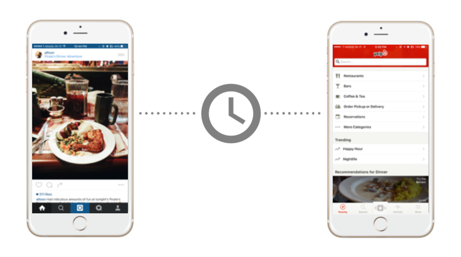
We get inspired by friends on social media, but that interest often leads nowhere because it gets forgotten. And when we search for information, we use a separate local search/review app. Worse still, those reviews are unreliable and difficult to trust.
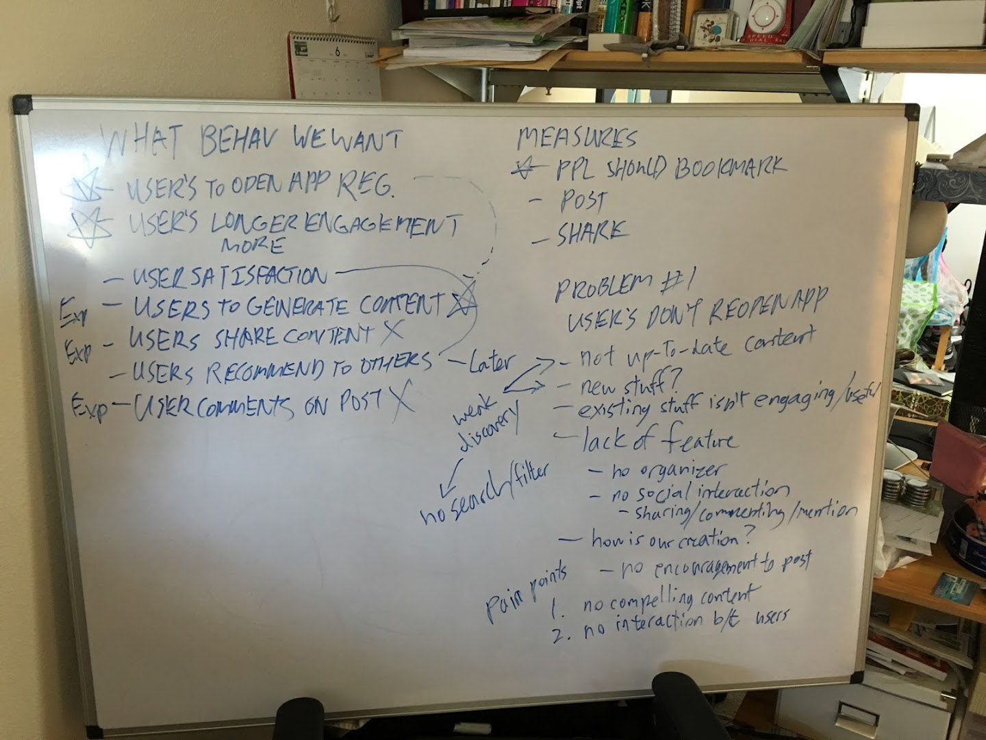
We asked how might we get users to engage in a different way to make place discoveries easier for users.
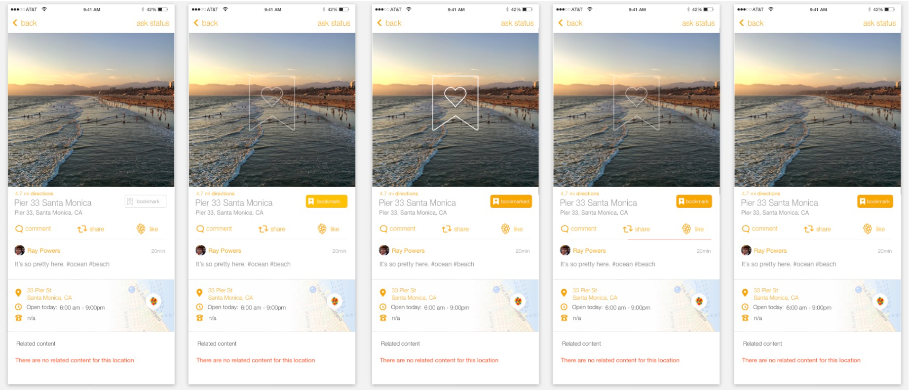
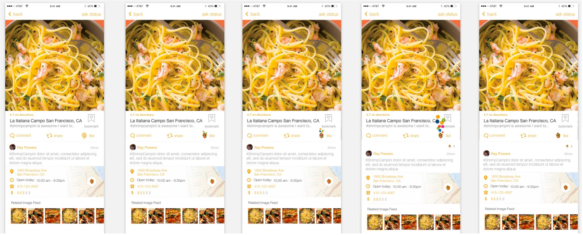
This idea led us to think about a different product that focuses on sharing images with geotagged locations, placing them as a social share, and turning them as bookmarks for future places of interest.
This idea led us to think about a different product that focuses on sharing images with geotagged locations, placing them as a social share, and turning them as bookmarks for future places of interest.
Team
The team consisted of one designer and three engineers. It focused heavily on research and interviews to understand what we wanted to accomplish in the product road map.
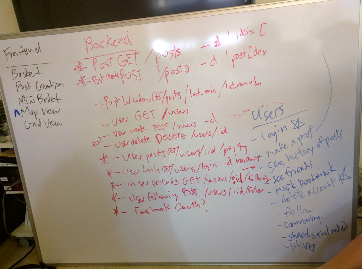
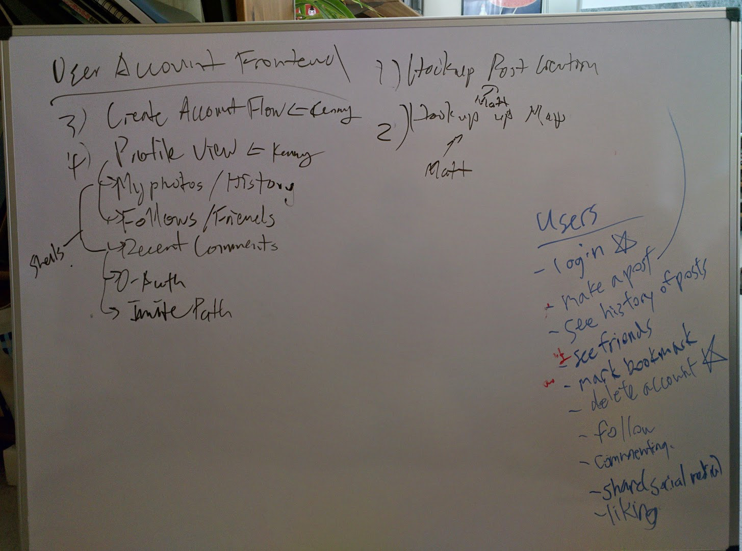
Methods and deliverables
User Interviews / Competitive Analysis / Persona Development / Wireframing / High Fidelity Designs / Design System Development / Pattern Library / Prototyping / Usability Testing
Validation
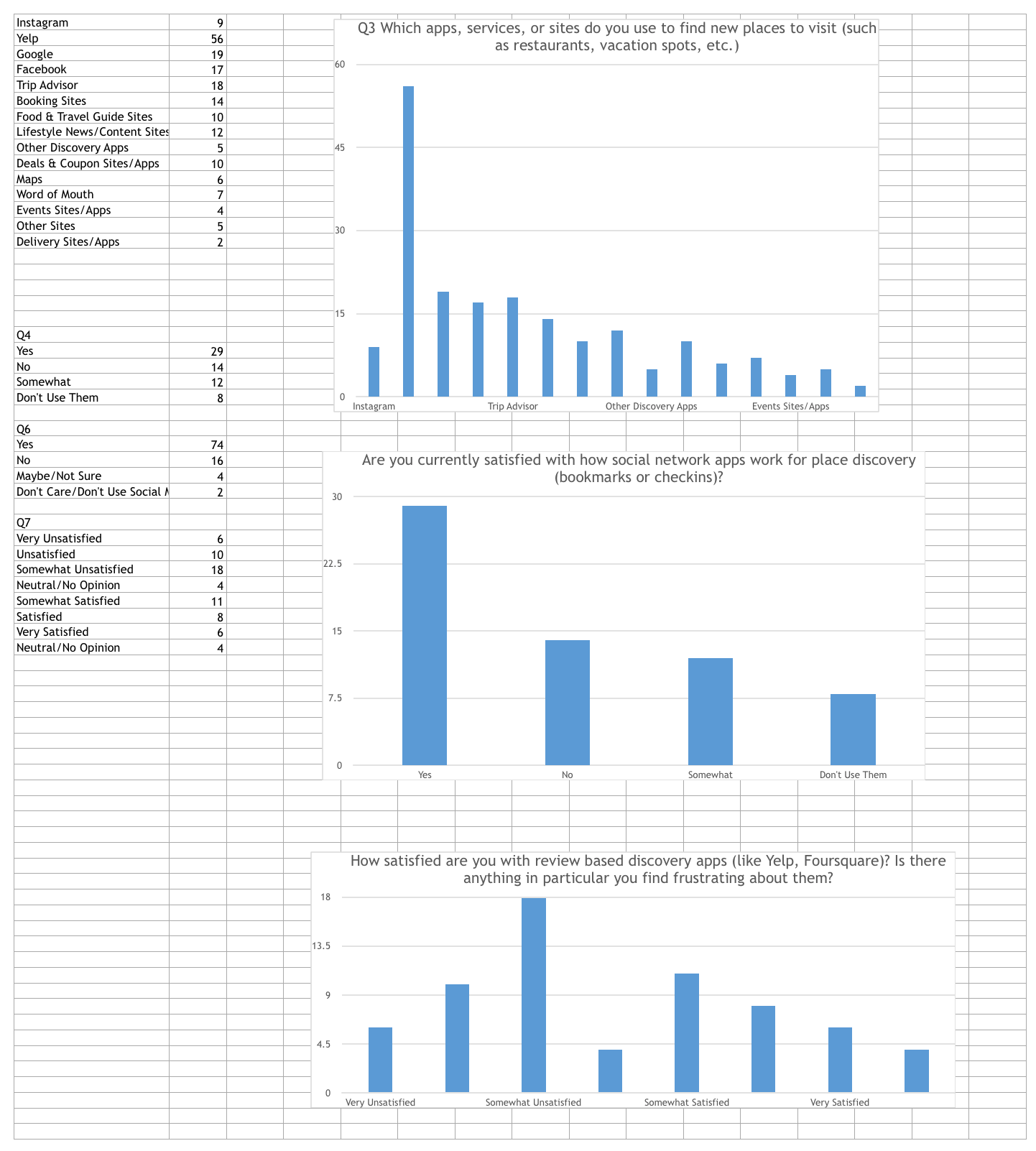
We went out and asked people through surveys and user interviews to validate our hypothesis.
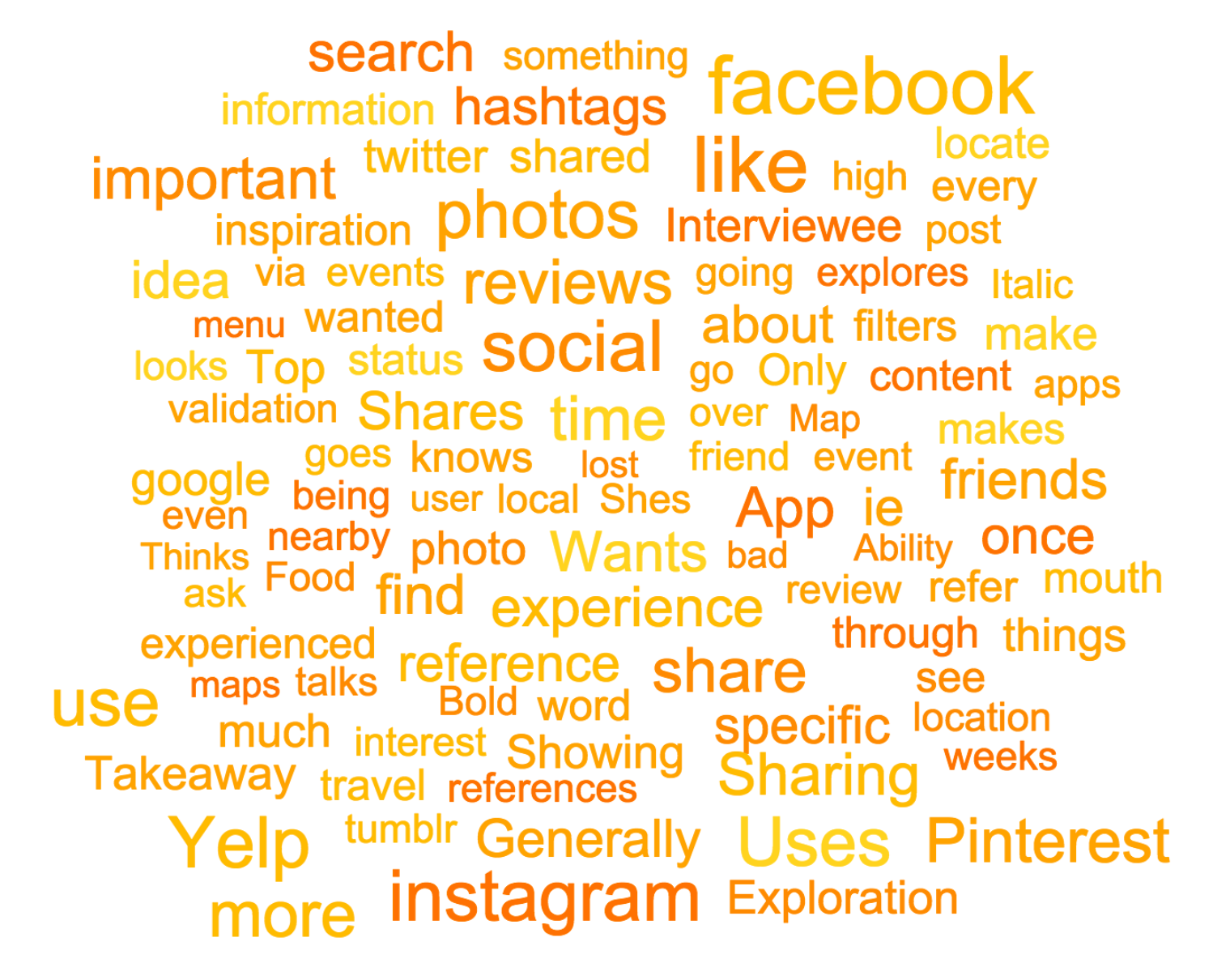
User interview frequent response
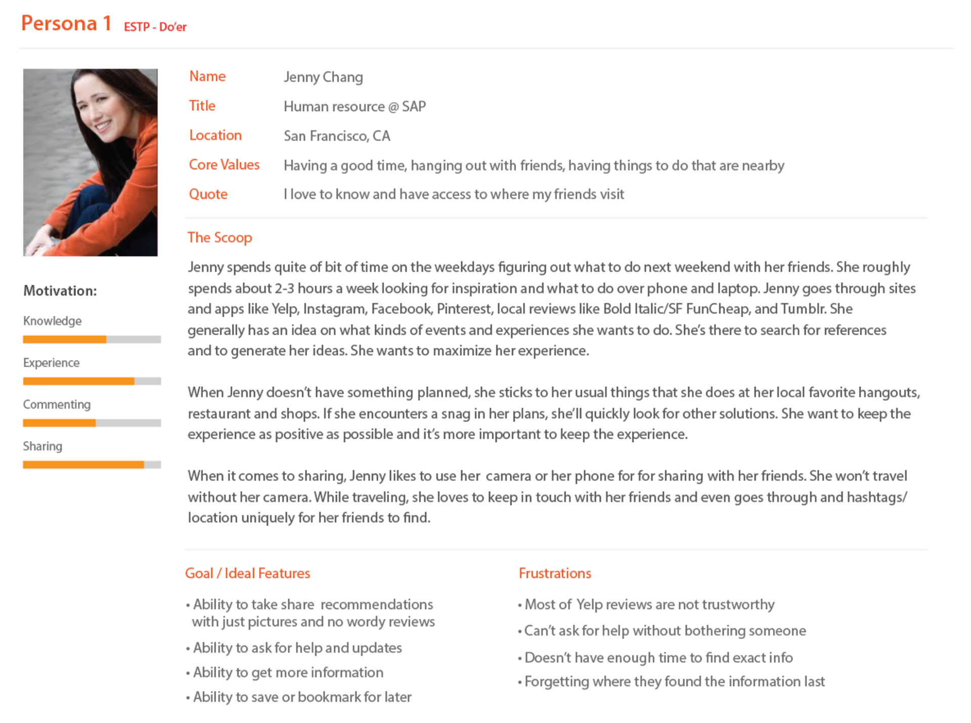
Persona
Discovery
What I discovered was that people want their (non-personal) social media shares to be tied with relevant information. They want to be able to share it with friends and extended networks to have access to this information. The value was that there was a source of information that could be closest to real time to understand any changes around place of interest.
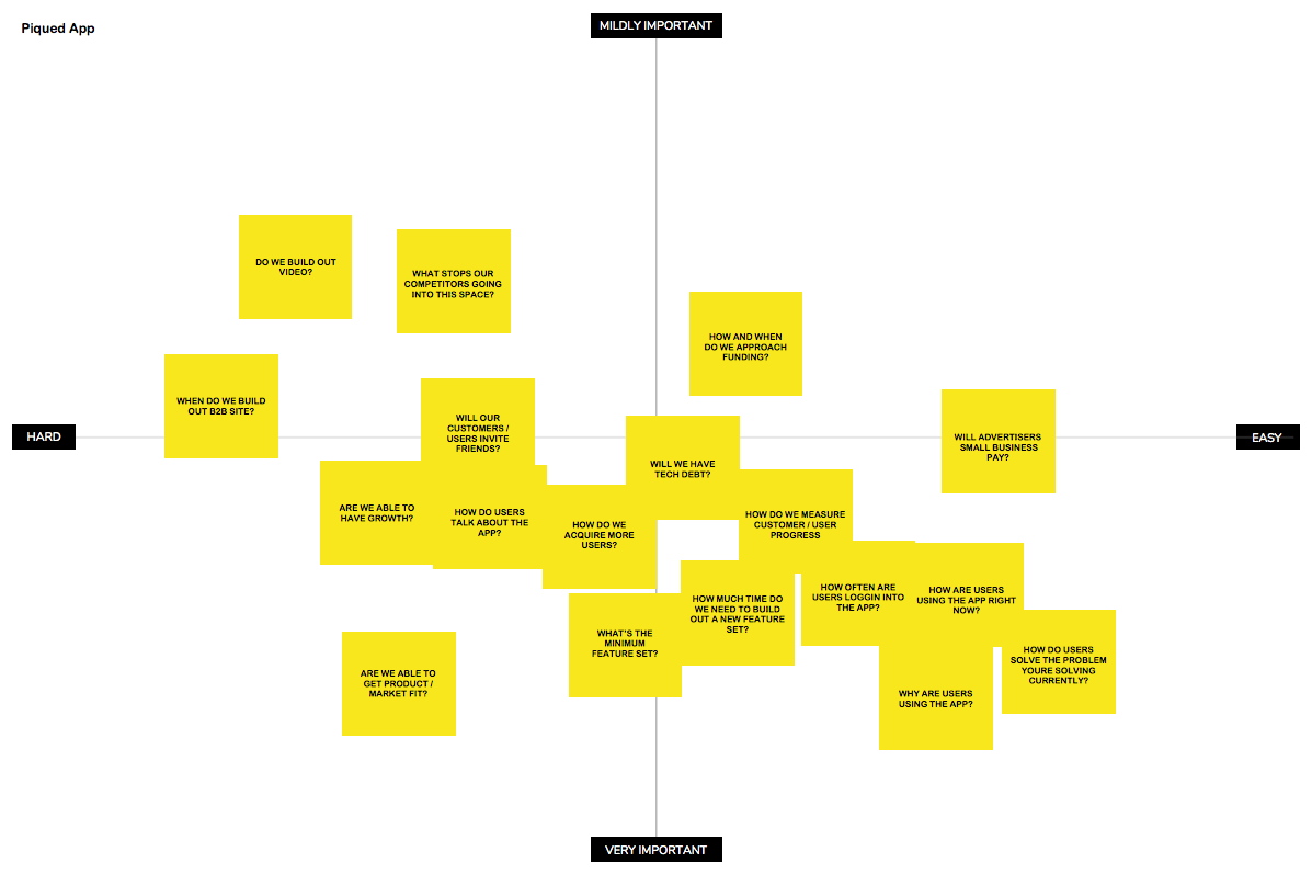
Product requirements
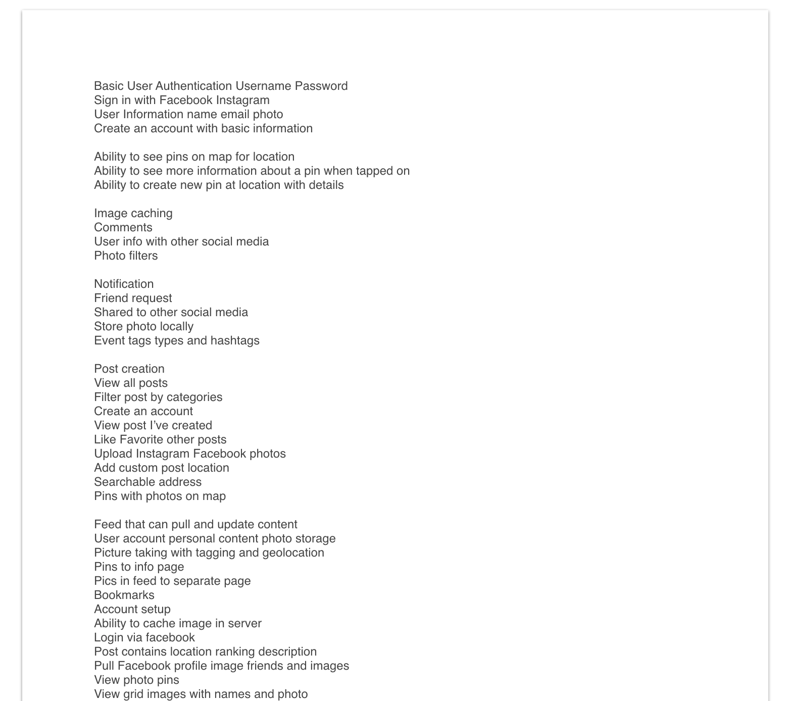
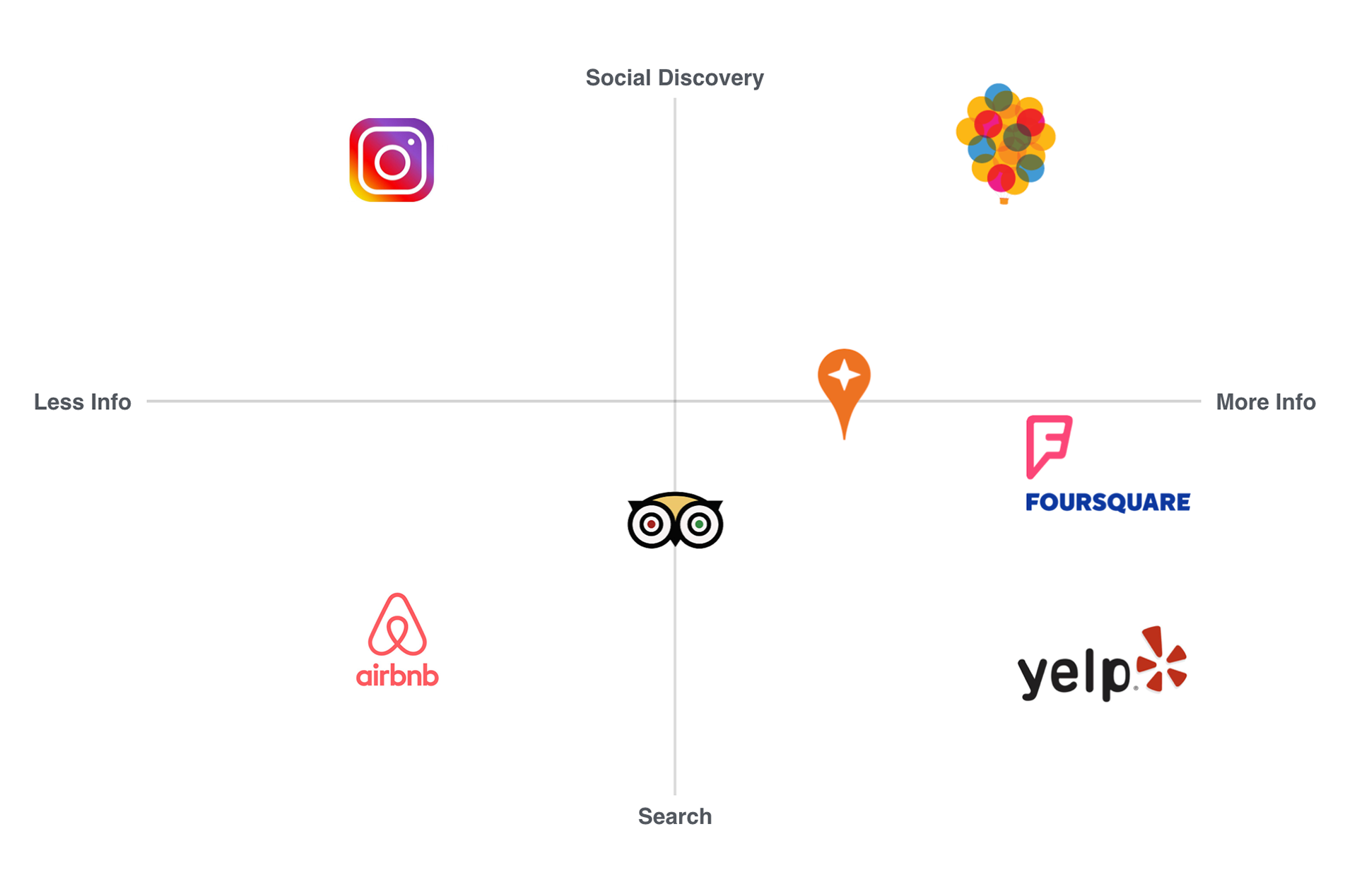
Competitive analysis
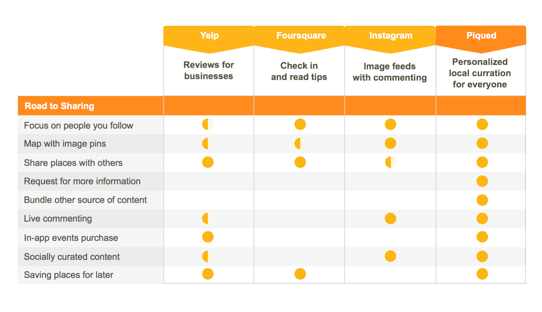
Competitive landscape
Align product with engineering and create flow idea
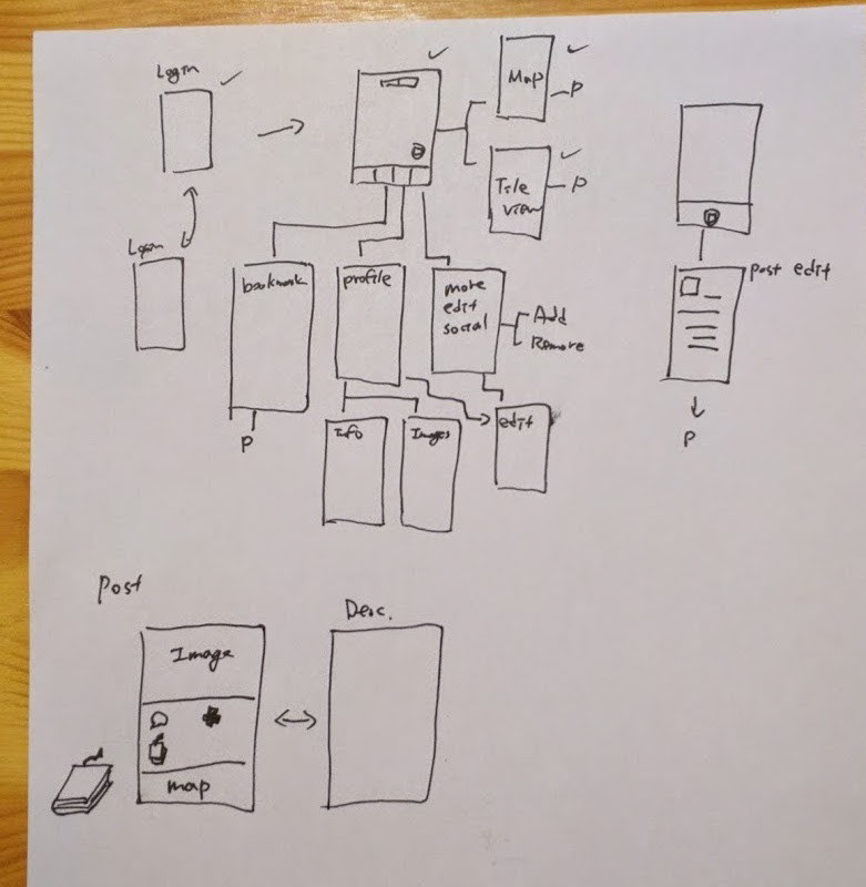
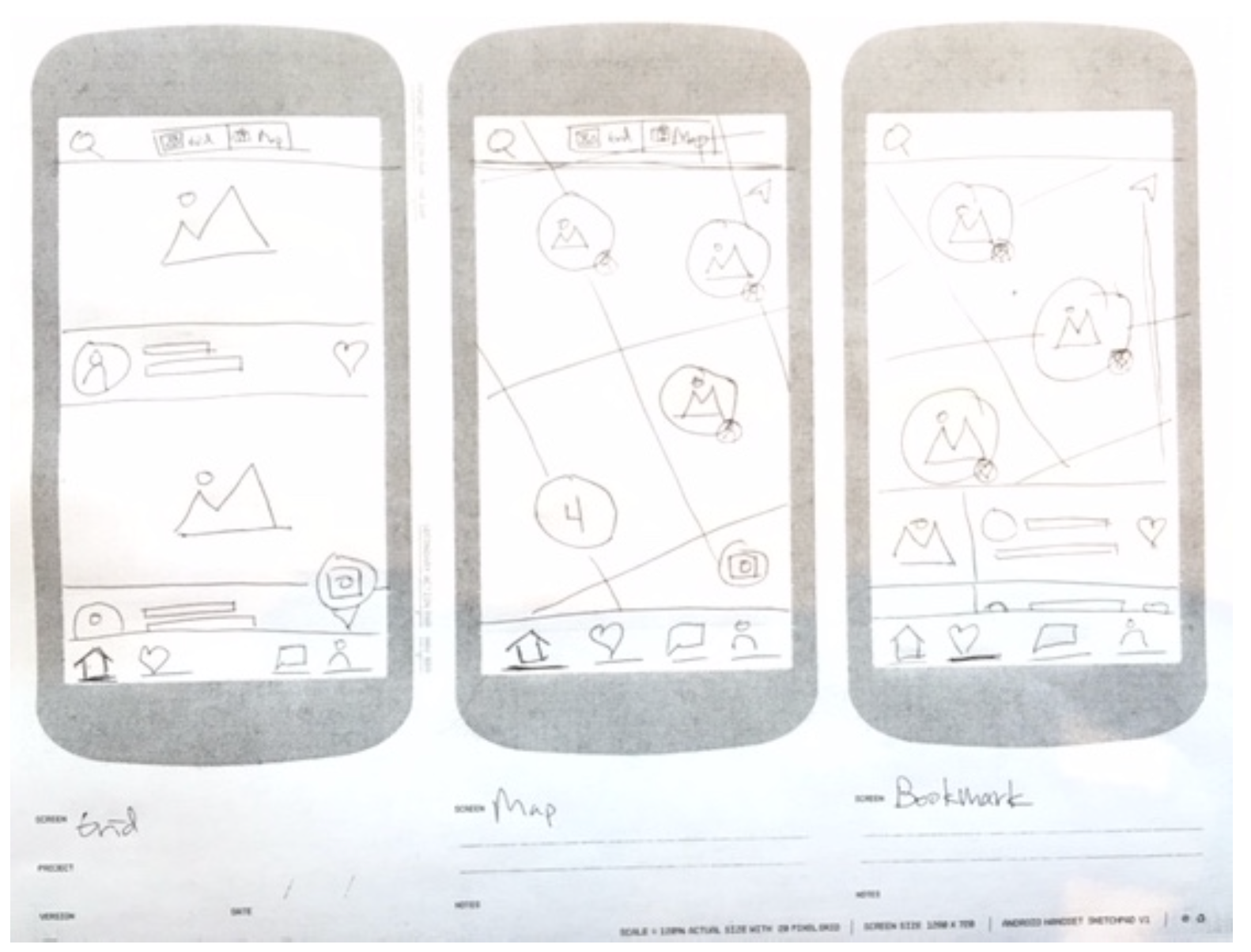
Paper wireframes
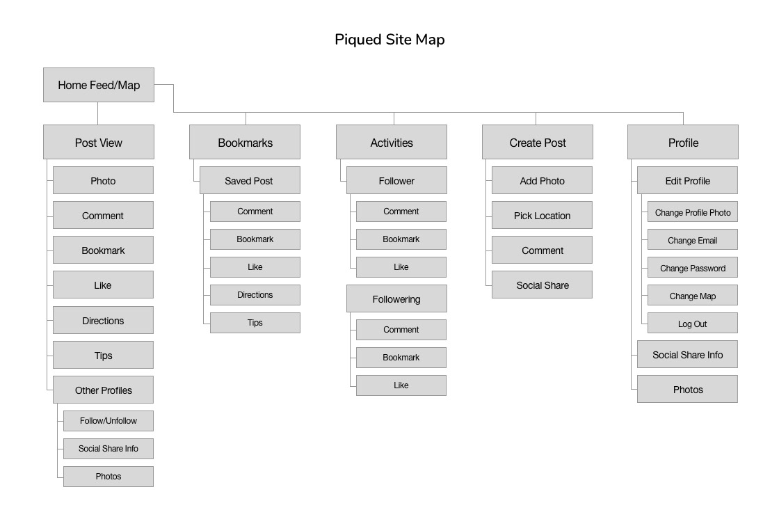
Sitemap
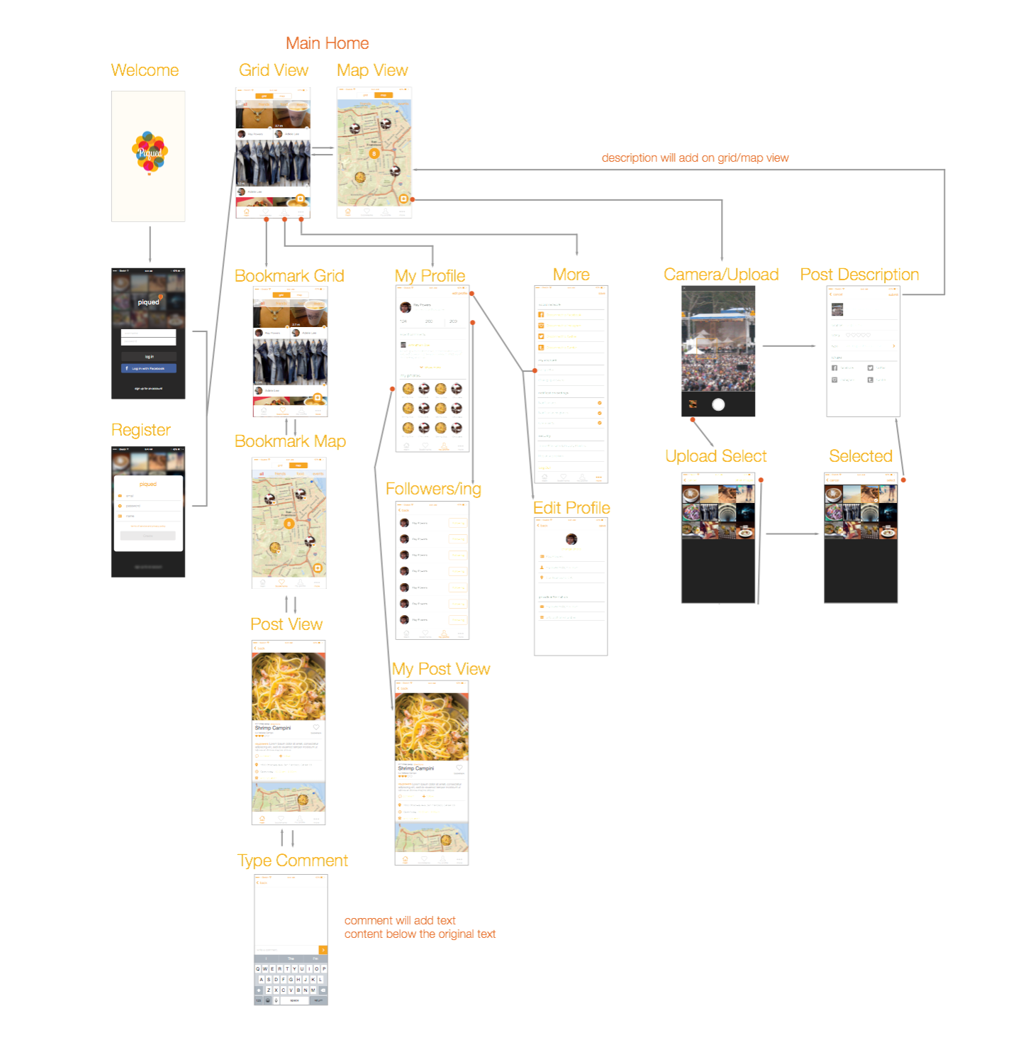
Interaction flow
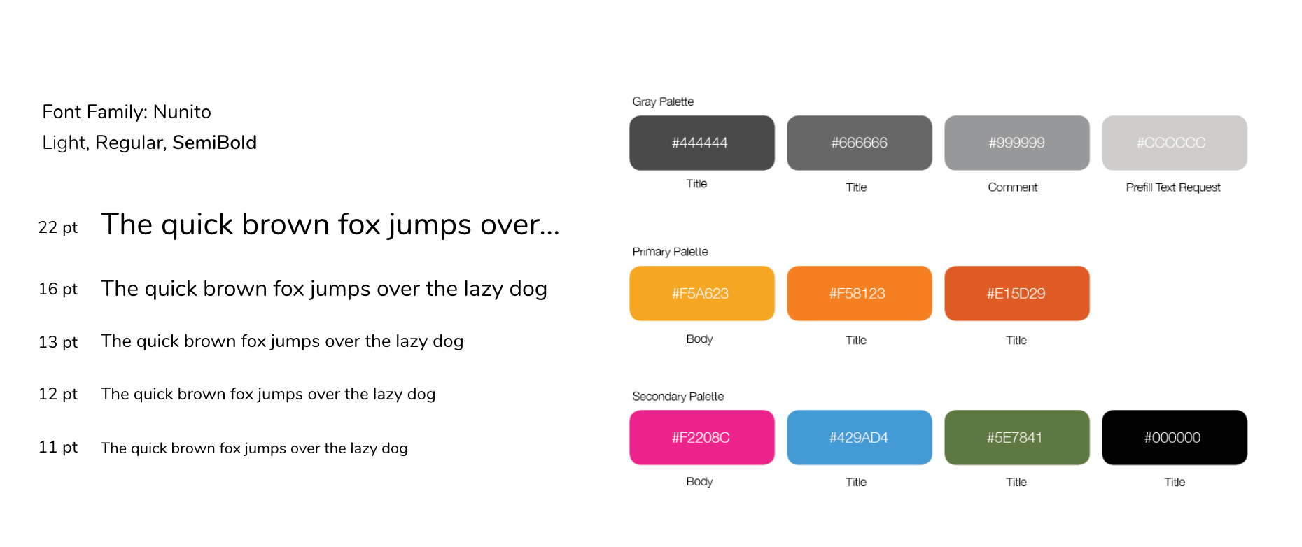
Style guide
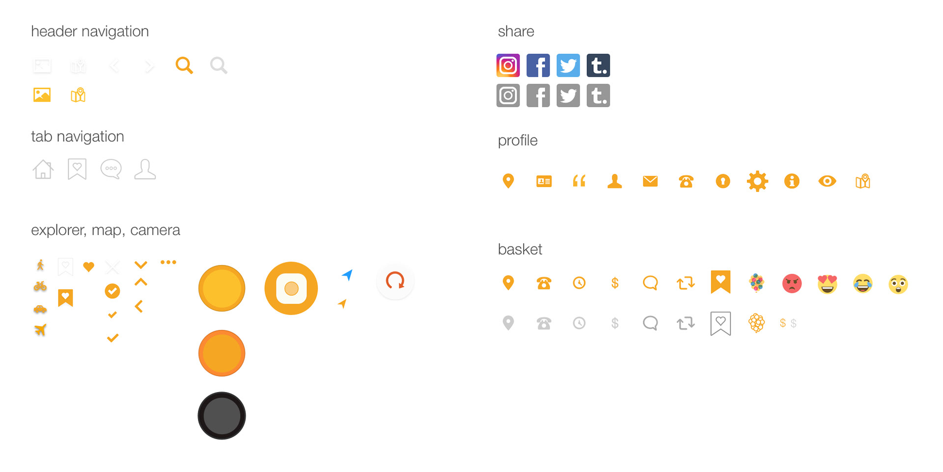
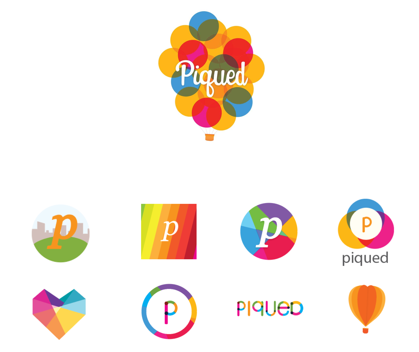
Logo design
High fidelity mockup
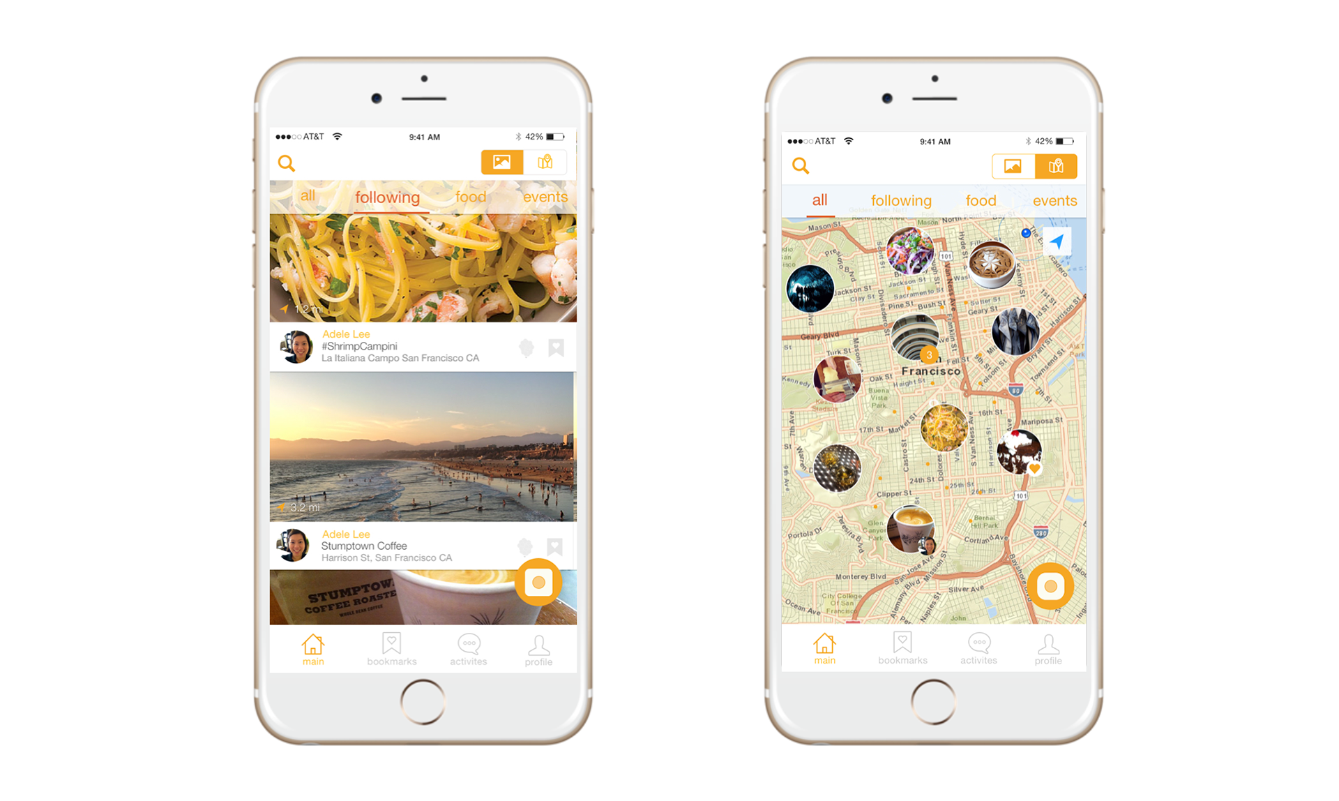
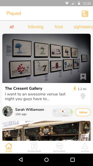
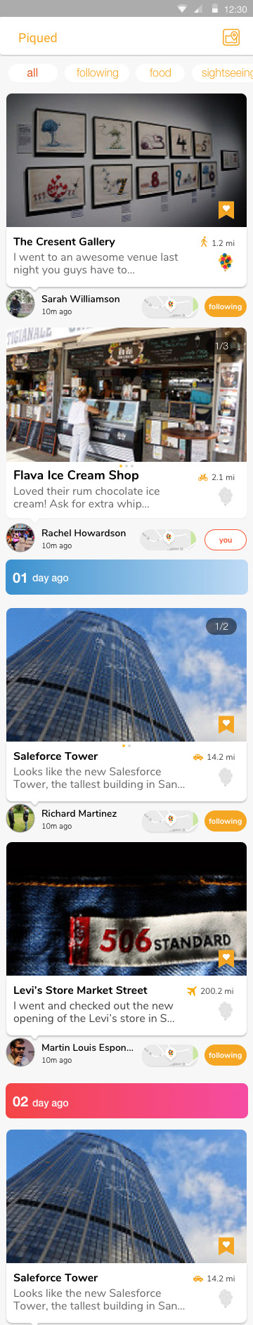
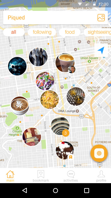
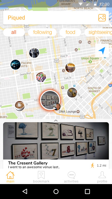
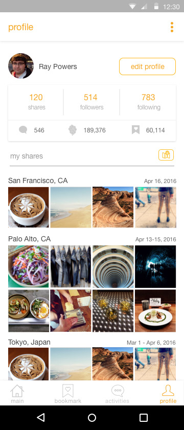
We looked at how users' were regarding the information for browsing and discovering places. We found that there were two stimulating experiences through feed view and map view. While map view is more utilitarian, the interaction between the user and sharer had more significant impact in the discovery phase.
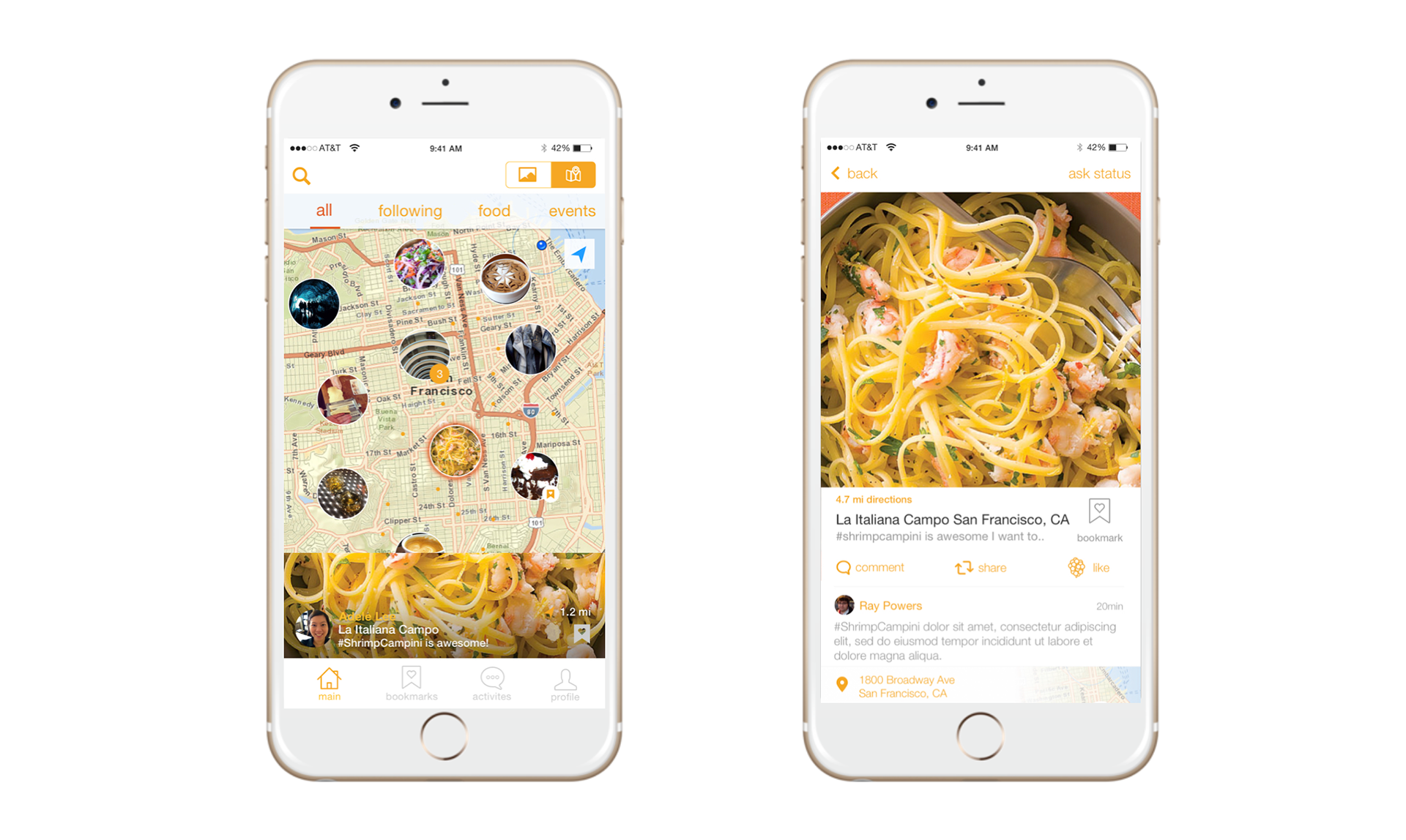
We made the mini description views as informational as possible while leveraging the maximum amount of space so that the user could still browse through out the map and find additional pins. We styled our experienced based on card design and the image would pull from the bottom up.
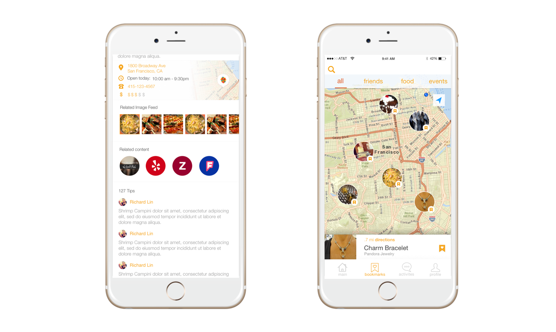
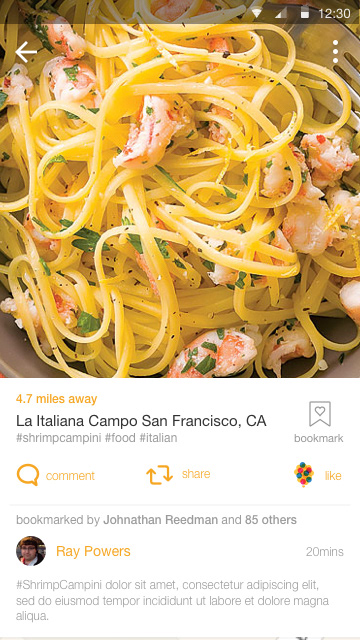
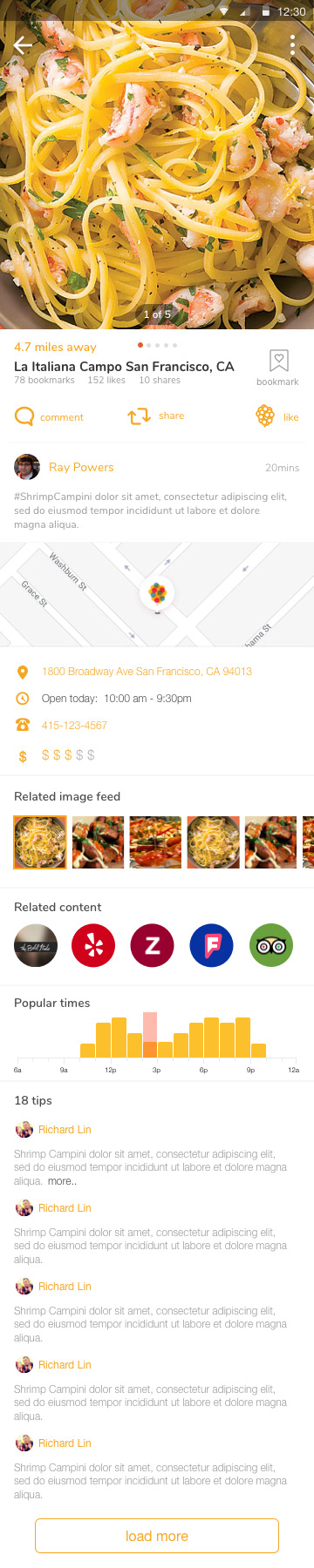
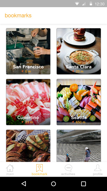
We added information based on user needs. Stemming from the share and comment first. Then following location, related images, third party content and tips. Our bookmarks focuses on finding places quickly around you.
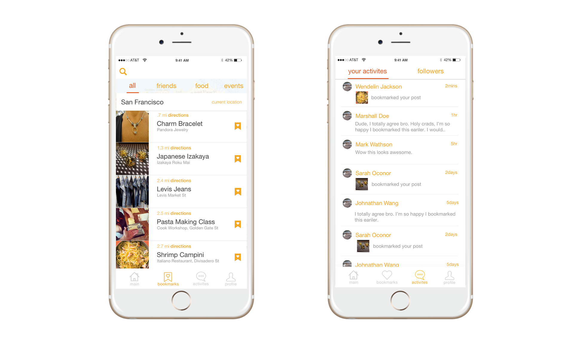
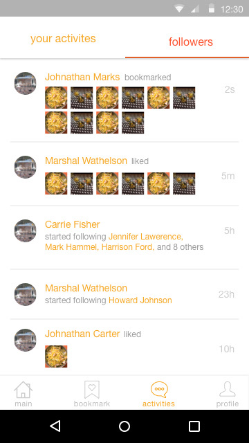
Especially based around the location that you're at and by city first. Secondly, we looked at making interaction quick and easy to find with push notifications pointing to the new comment, likes, and bookmarks.
Microinteraction
Build, user test, and iterate
As we've been progressing our product we've been looking how to sort our product road map. We've done this through series of user testing and feedback sessions, then looking at our product goals to align what we'll be making next.
2.0 Experience
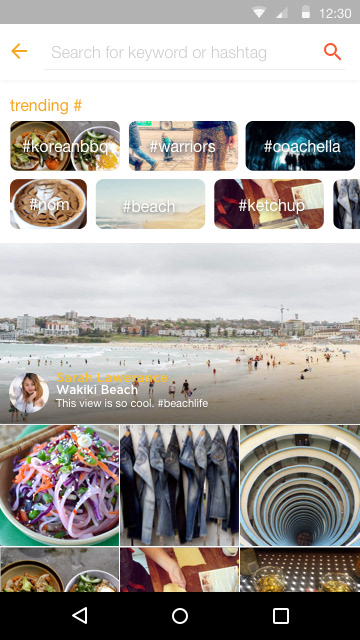
Through our feedback we looked at how to make more improvements to the experience. Most requested were: easier access to map locator, adding multiple images, easier way to follow other users, instagram integration, and search functionality.
Takeaway
Piqued required me to wear multiple hats in trying to understand product and what product managers do. I looked at product in a different scope. As the product started to see traction we had to constantly trying to think what we wanted to do next. I needed to understand which feature took priority and why. I had to convince and get buy in from all stakeholders. It was a challenge because generally I would have product manager where I could bounce which features should be prioritized. It taught me very well on what I didn't want to do and what I wanted to work on in the future.