
What does it take to get digital security at home?
That's what Symantec Norton asked to help them answer that question. They were ambitious to create the first security wireless router focused in protecting the home from the network itself. By creating one of the most powerful wireless router required ease of use and focus on how to drive navigation for the user.
Project makeup
Method
User interviews, Competitive analysis, Personas, Wireframes, High fidelity designs, Design system / Pattern library, Prototyping, Usability testing
User interviews, Competitive analysis, Personas, Wireframes, High fidelity designs, Design system / Pattern library, Prototyping, Usability testing
Duration
18 months
18 months
Team
Two Senior designers, Design contractor, Content strategist, Product manager, Engineering staff
Two Senior designers, Design contractor, Content strategist, Product manager, Engineering staff
Initial assumption
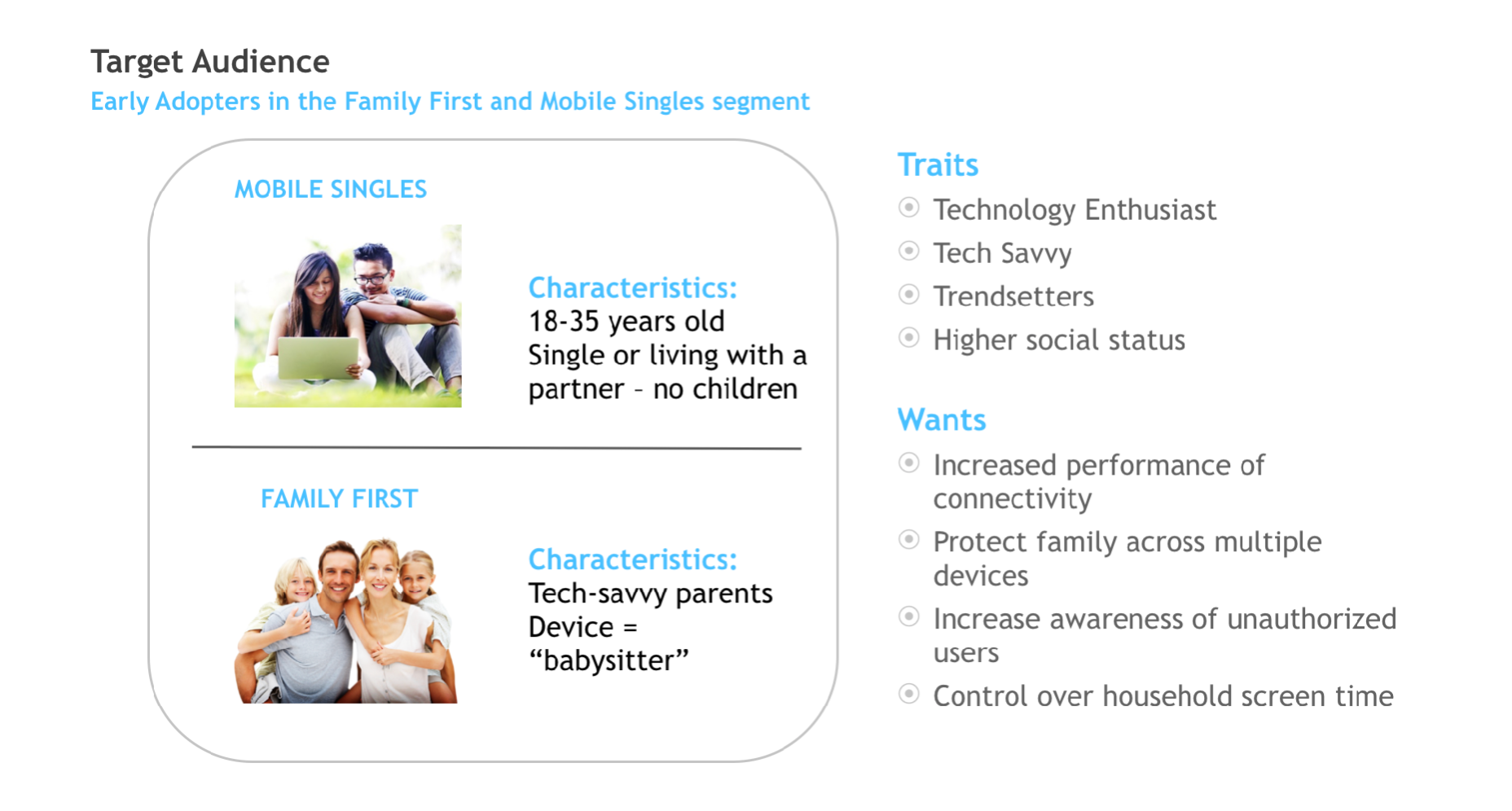
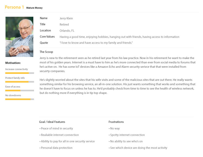
I joined Norton's IoT team post kickoff, and I came into a project with certain assumptions of the initial demographic audience for the project. Much of the research had merit, but I wanted to validate their findings and initial assumptions. They had a high belief that the security router would be adopted by earlier users and family members based on Norton surveys and interviews.
First revised persona
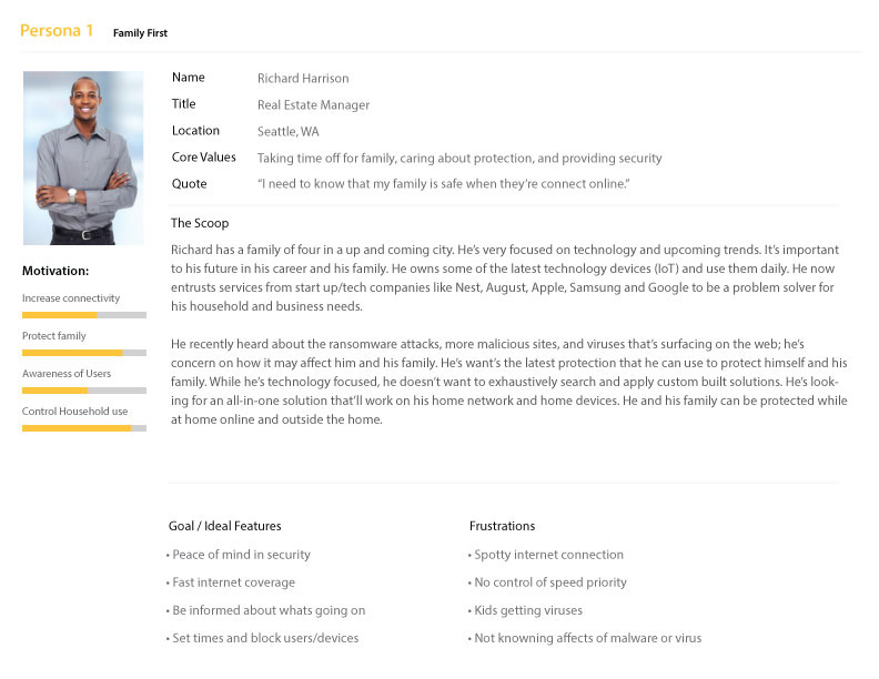
After interviewing with beta testers, I validated several key insights from initial findings and generated an updated version of the persona for Norton Core users. We doubled down that the family first would be our most significant customer base as our targeted features matched their needs more than early adopters. This discovery helped us lead our efforts in making changes to the UI and finalize the features we wanted to focus on first.
Competitive features
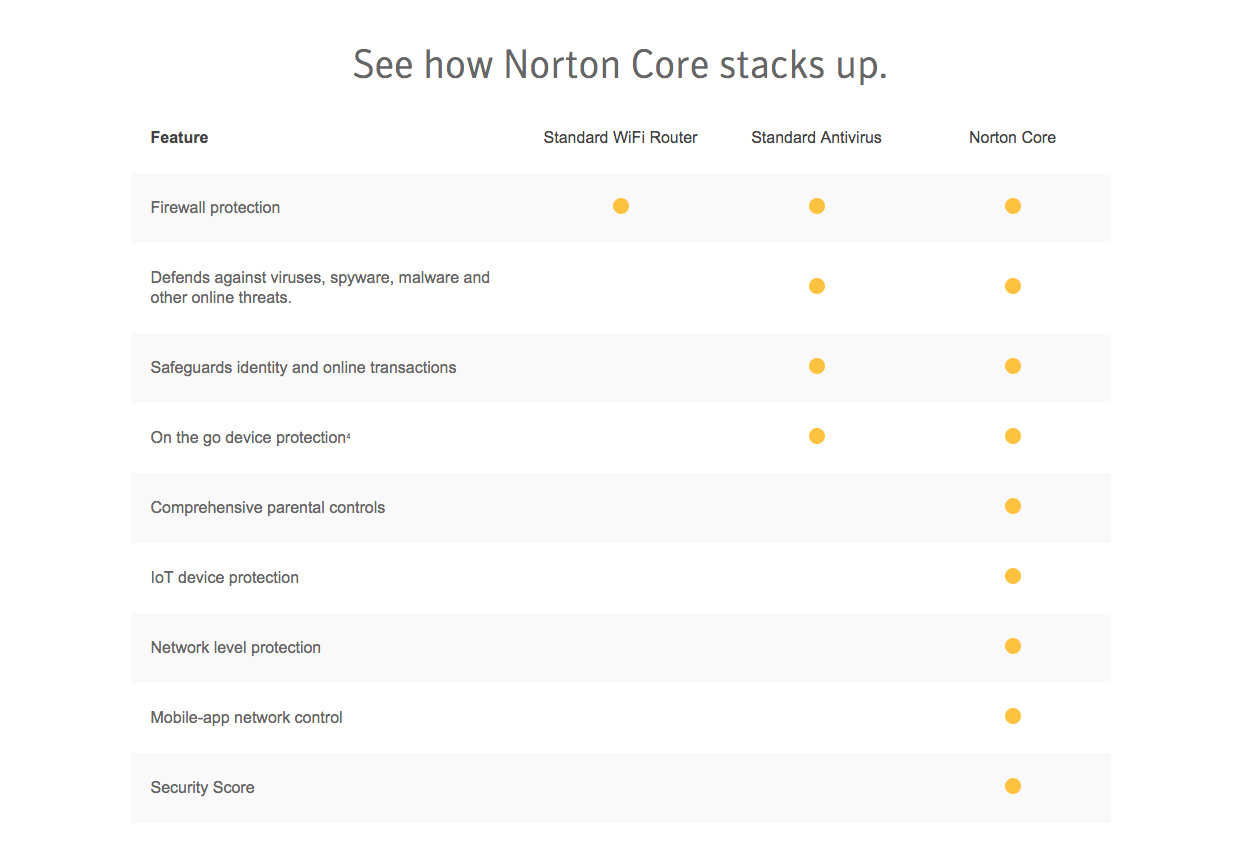
We looked and compared multiple products ranging from Google WiFi and startups like Eero to traditional brands like Netgear and TP-Link, based on their heuristic evaluations, we came up with which features gave us the most competitive features and advantage.
Red route analysis
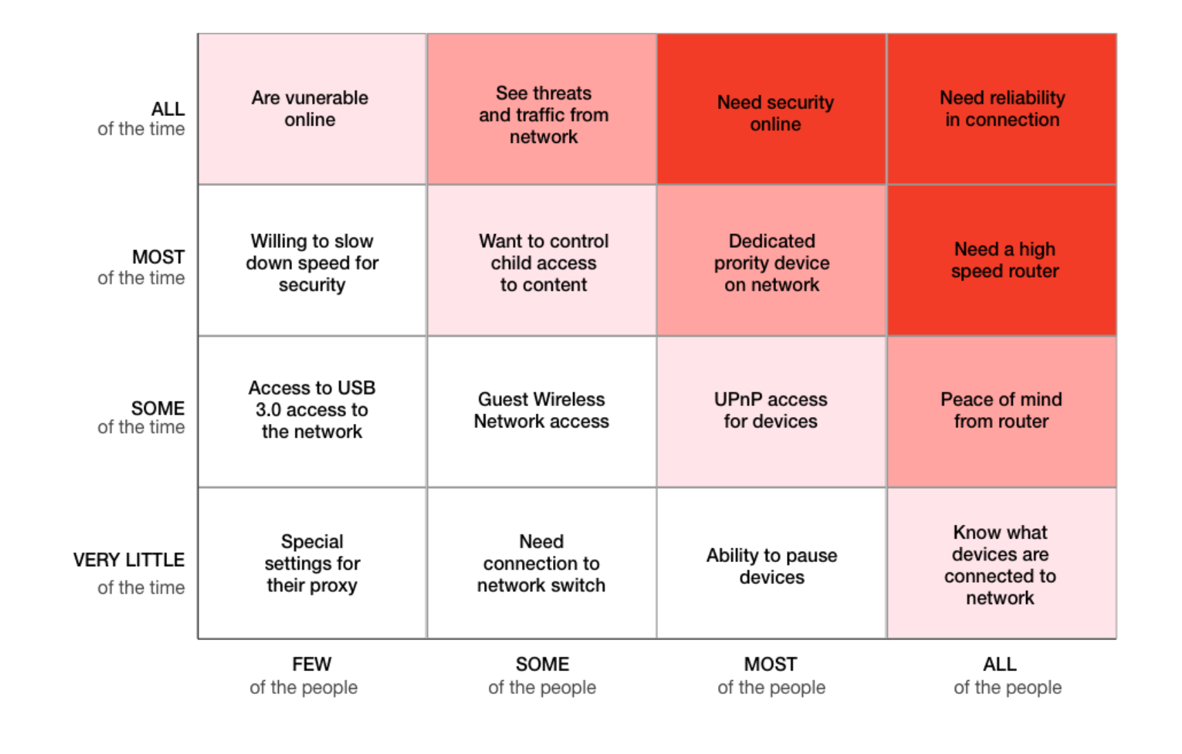
Additionally, to understand which features were most valuable, we assessed the most needed features by our user as a must focus in our our design build. We analyzed user needs and their sentiment on how they rated the most important priorities and needs. Some of the major alignment was a concern, especially the reliability in connection from the product as needing the security portion could every now and then conflict with internet speed and traffic. Understanding this issue, we constantly thought about how some of the product functions could operate in the background so that security wasn't bogging down reliability.
Design goals
After realizing some of the key missing features, I worked on focusing on making three pieces.
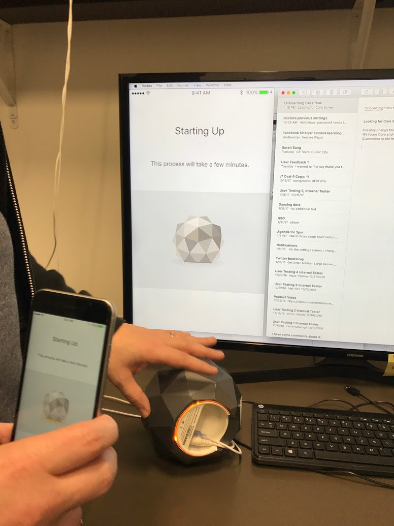
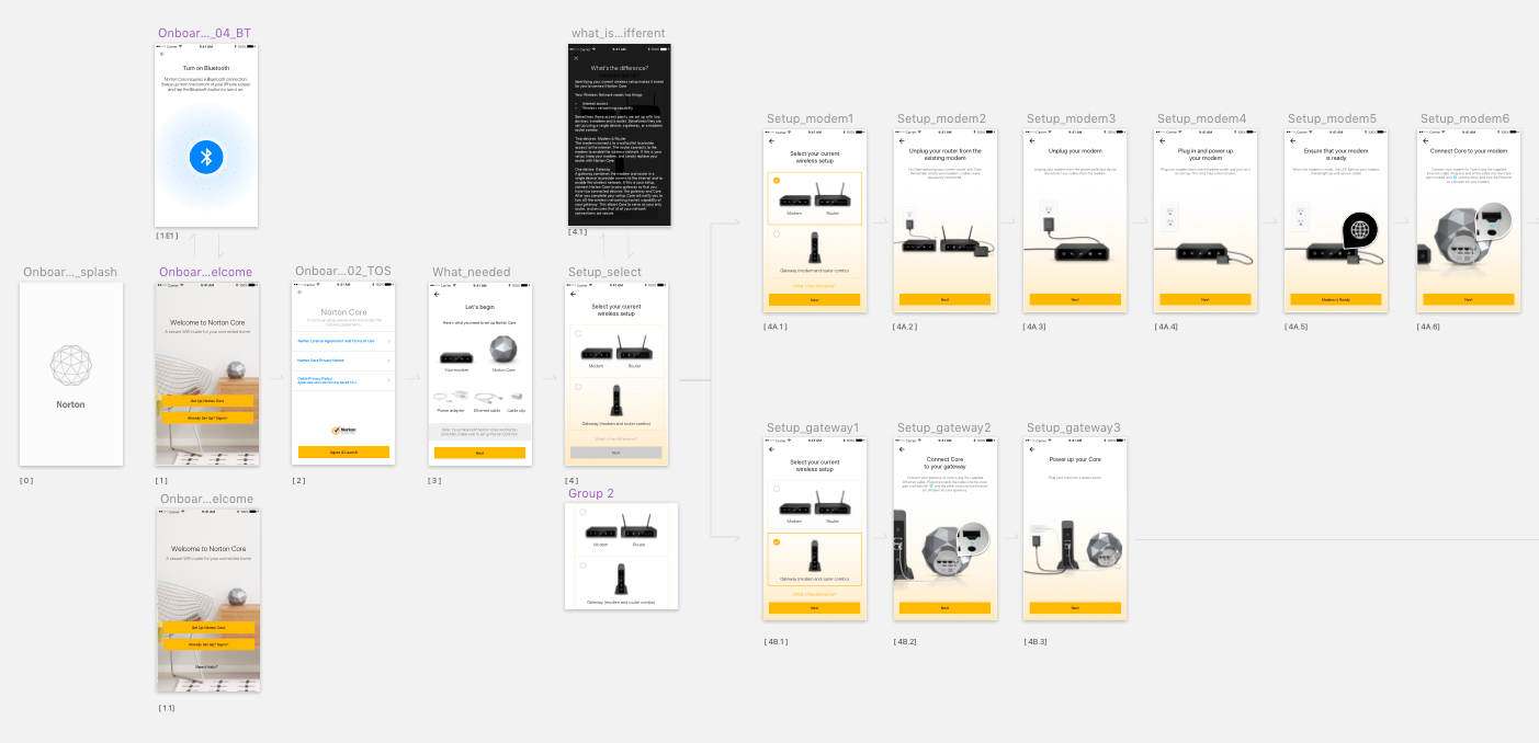
Make onboarding as quickly and easily as possible, with plans for user errors.
Help the user keep track of who and what were accessing their device to understand their digital safety.
Empower the user to take action from situations outside and inside the home.
Make onboarding as quickly and easily as possible, with plans for user errors.
Help the user keep track of who and what were accessing their device to understand their digital safety.
Empower the user to take action from situations outside and inside the home.
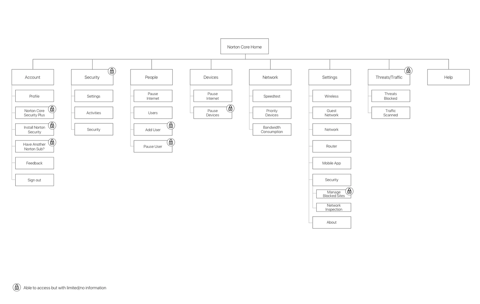
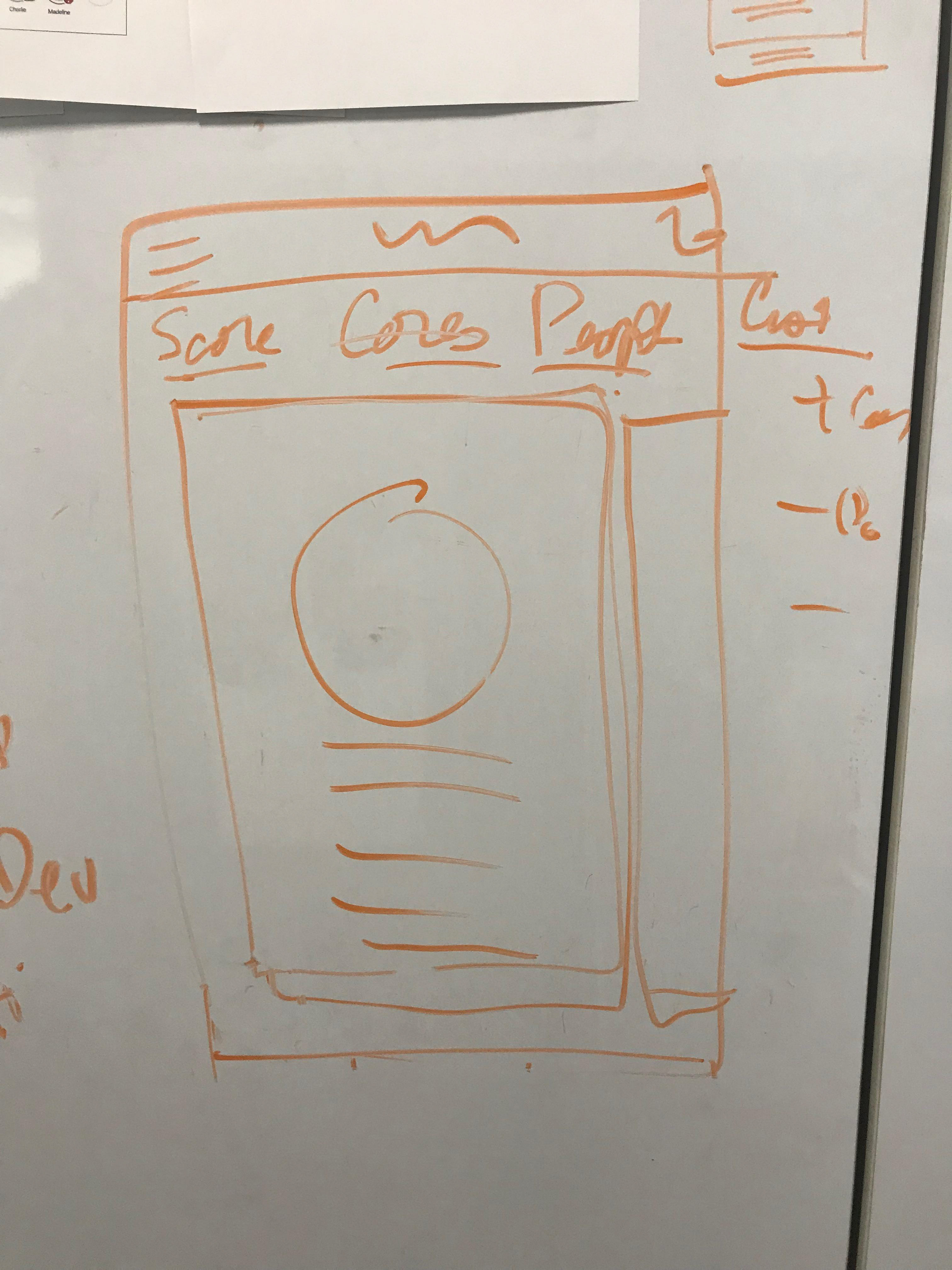
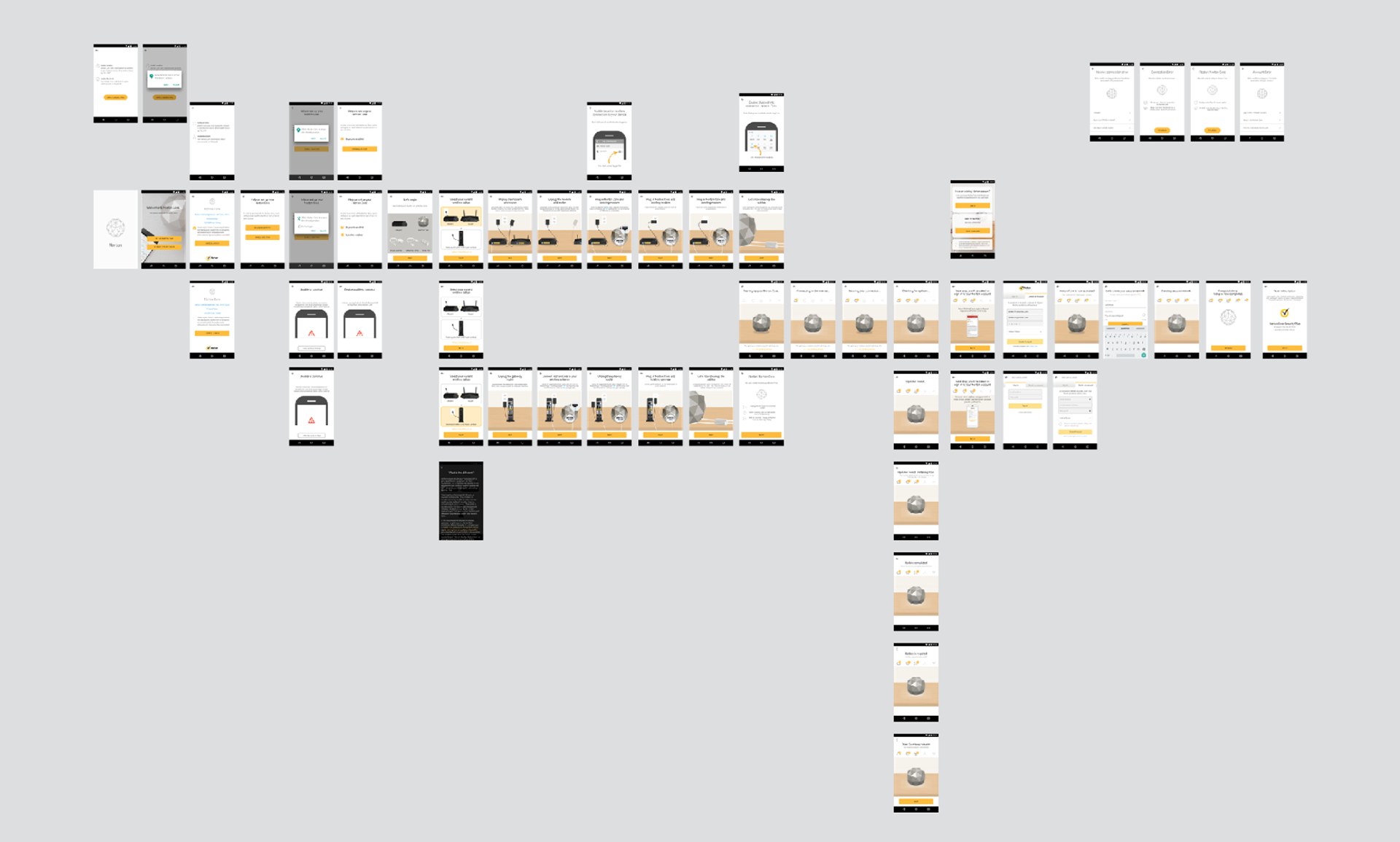
Sitemap
Redesign UI goals from new learning
I wanted to focus on the users sense of security and how it protects their family. None of this was being conveyed with their previous designs, it had no focus, and was lead by management. The pre-launch task was to refine portions of the UI designs to help guide user to set up their Norton Core for each family member. We spent one week design sprints to figure out how each feature would align to the value of the product.
Home
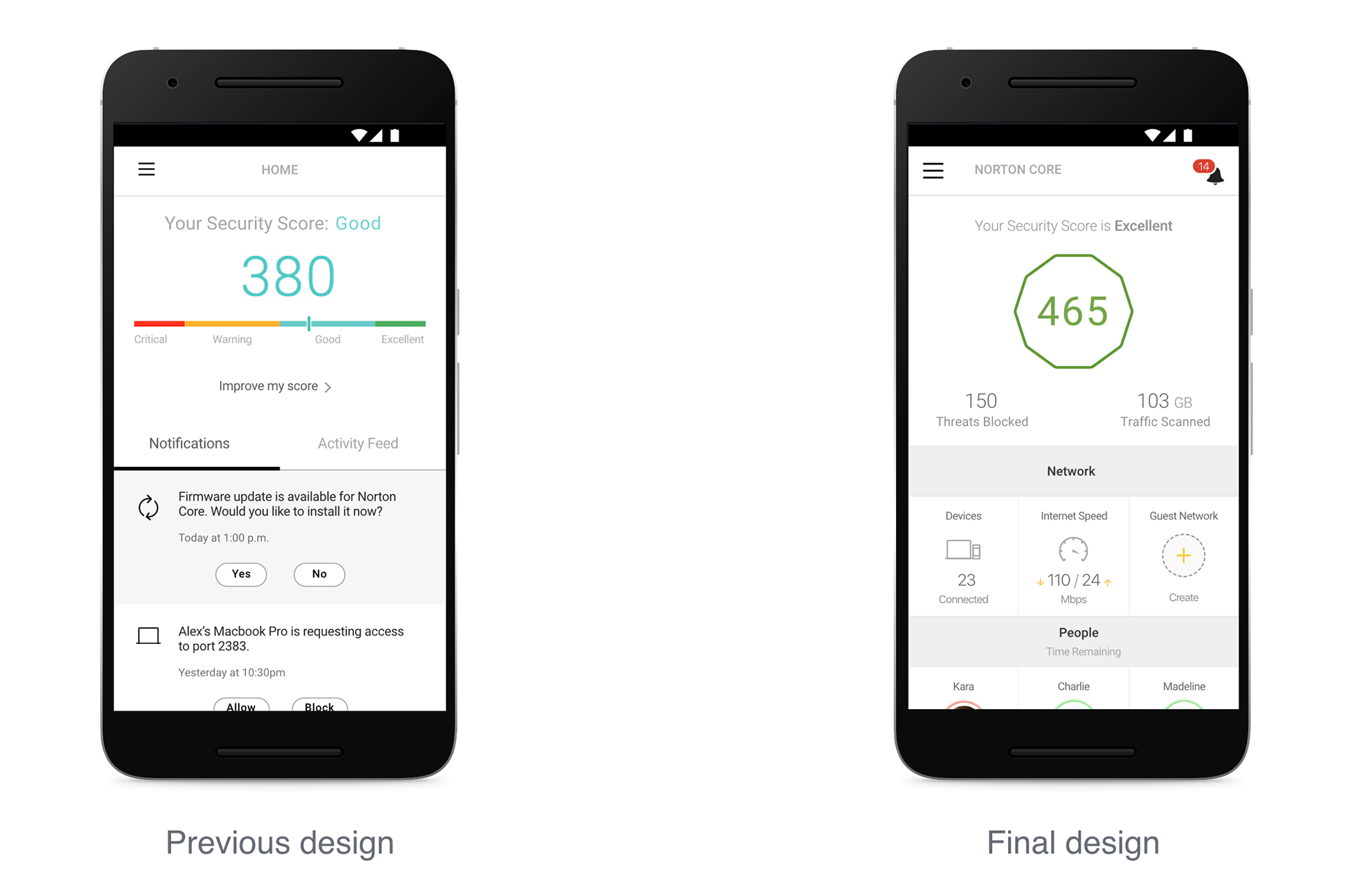
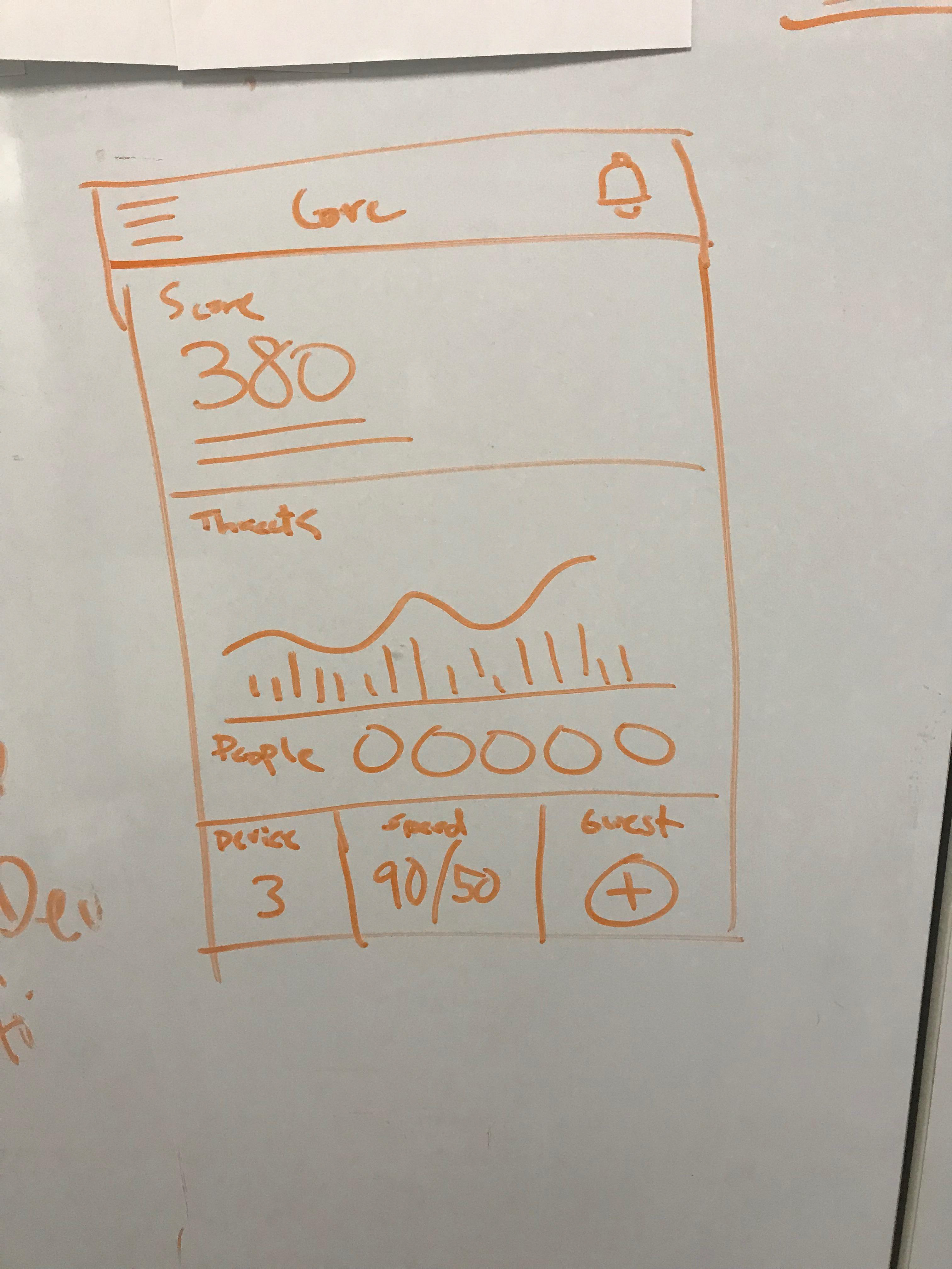
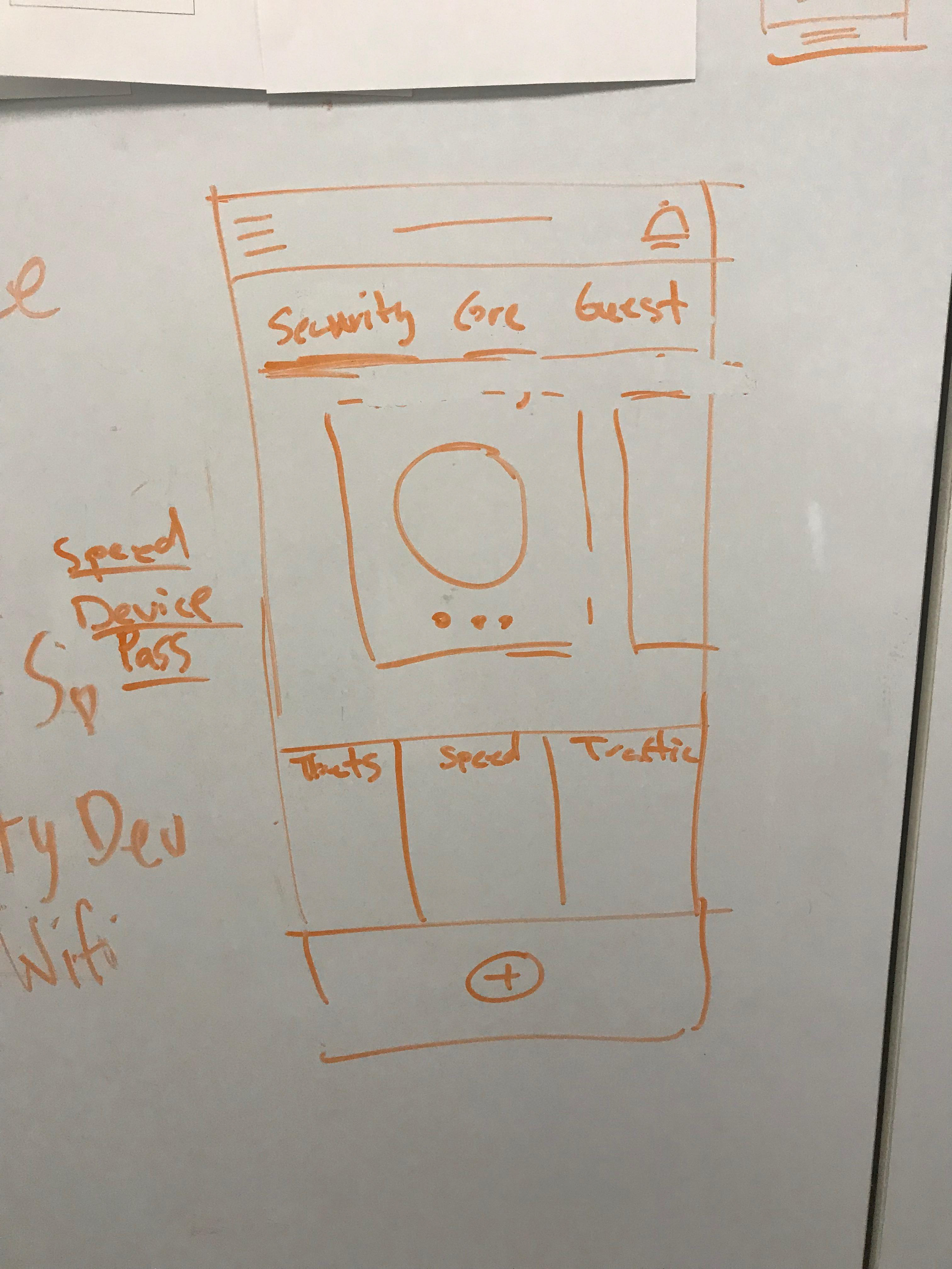

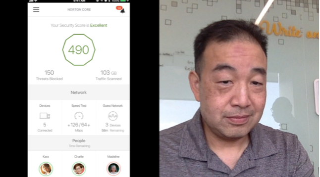
First major change that we looked at was adding in a dashboard for the home view. Users didn't understand what the value of main home view. We looked at ways to enhance the features by not just showing a score with notifications, but combine which features were creating the outcomes for that score. Each feature would be interactable and editable, which in turn would change the value of the score.
People
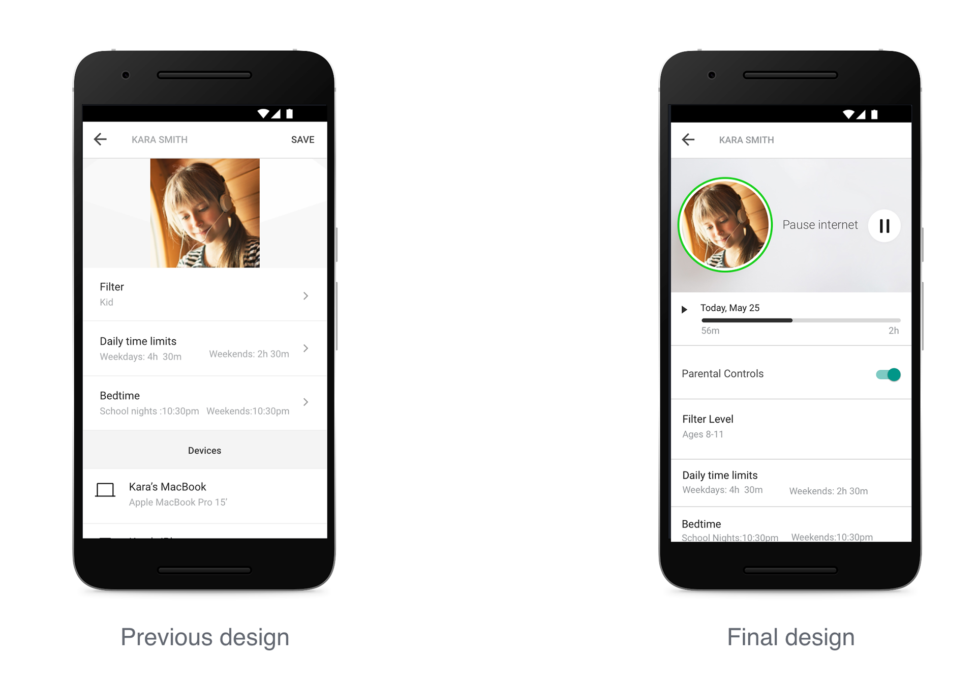
Original people feature lacked reason for the visit, as it was designed to only create and forget about an added person in the family. We discovered when kids had to do homework that had sensitive topics, our security would prevent them from accomplishing it. We needed to give it more purpose. I saw the opportunity for users to become a super user. To add time spent, the ability to pause the user, and be able to toggle parental control on and off. These focused on how users could quickly see the summary and react. We did the same thing for devices as well to allow the user to pause at the device level.
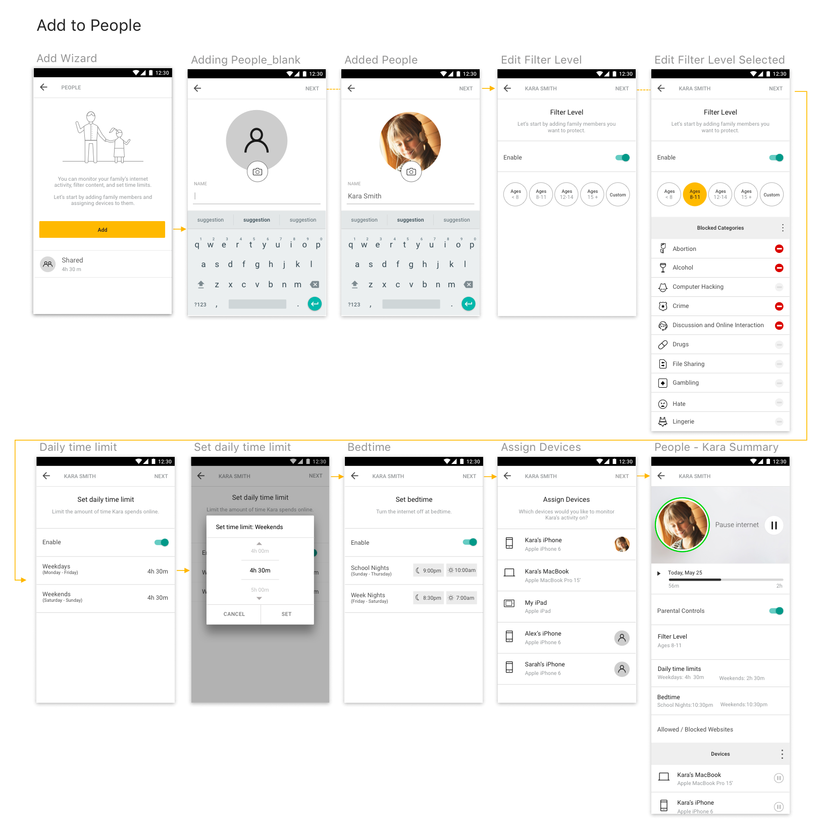
I explored ways to simplify as much of the flow we could to prevent abandonment in adding a person in the people flow. Essentially our goal was to get the primary user to add all family members.
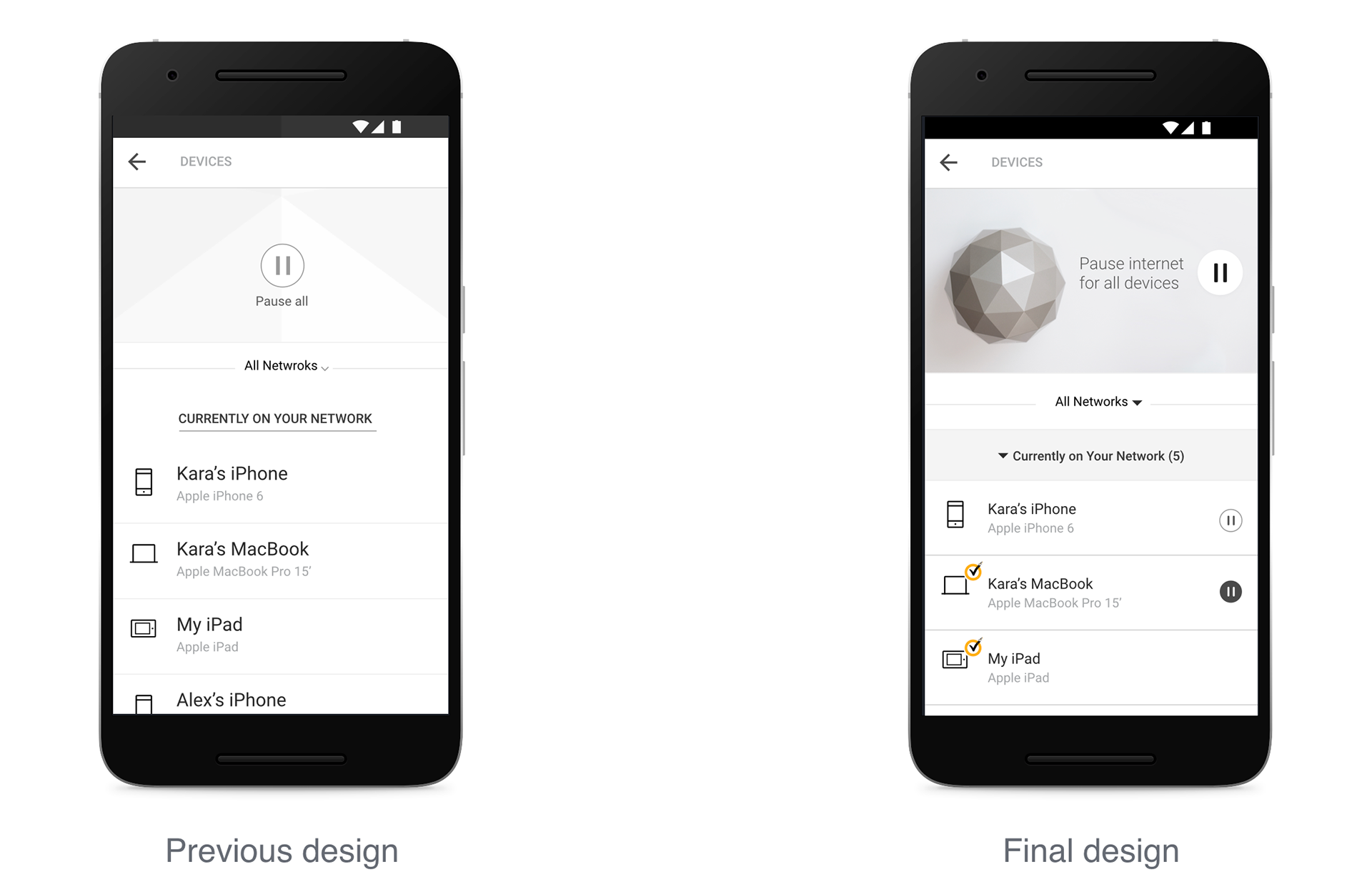
I saw similar kinds of opportunties inside devices. At a device level giving the right set of information of how people were protected and the ability to turn on and off a device would empower the main user.
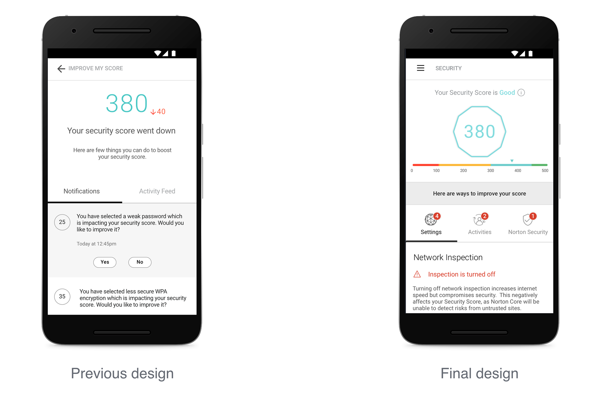
Instead of actively making the user worried about how each action had a number impact on their security score, I looked at giving a precise detail to the user on what they're missing. And how this would affect their security score as the main purpose. This would lead to making the right decision for their home and improve their security rather than force it.
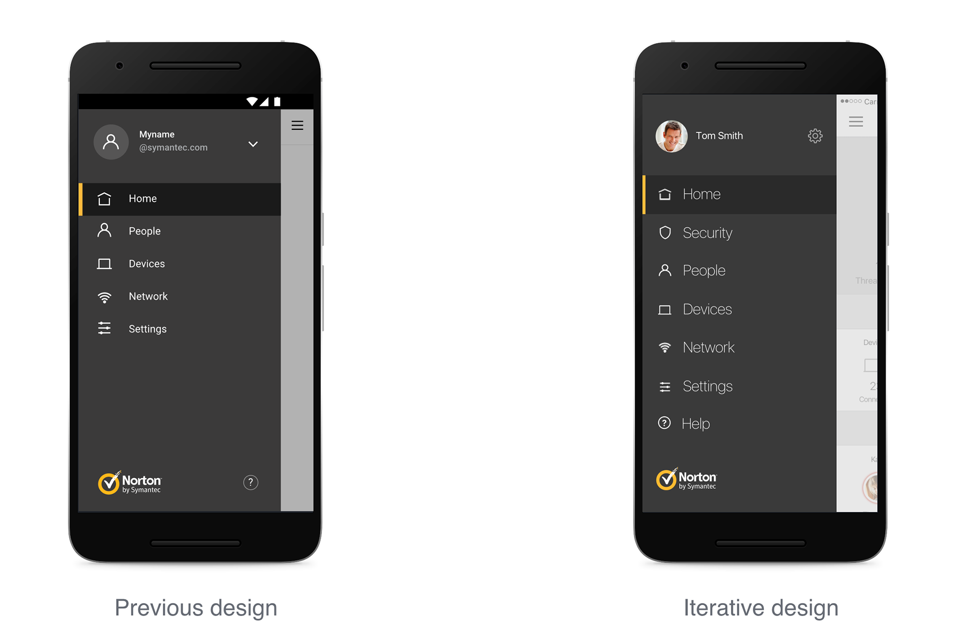
I made navigation menu even more intuitive by laying out all buttons in one column. I wanted users to quickly view and tap on the navigation without losing focus on what they wanted to visit. Usability was the main focus so that a user would never get lost in the menu.
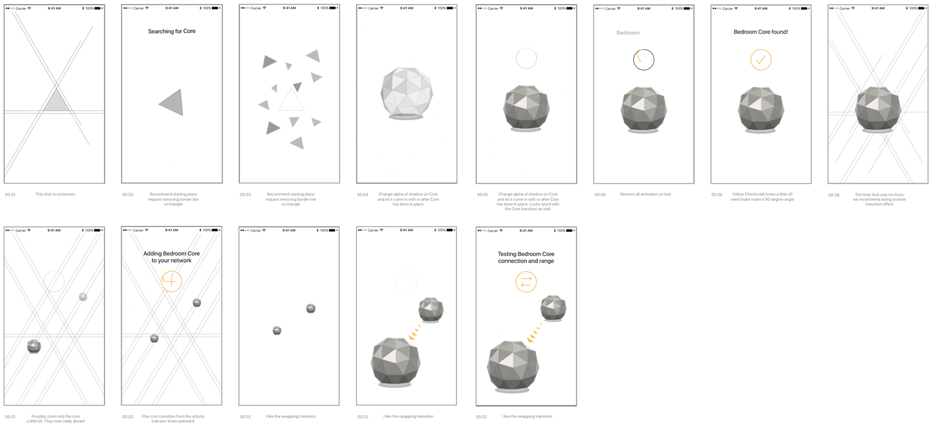
Working closely with hardware
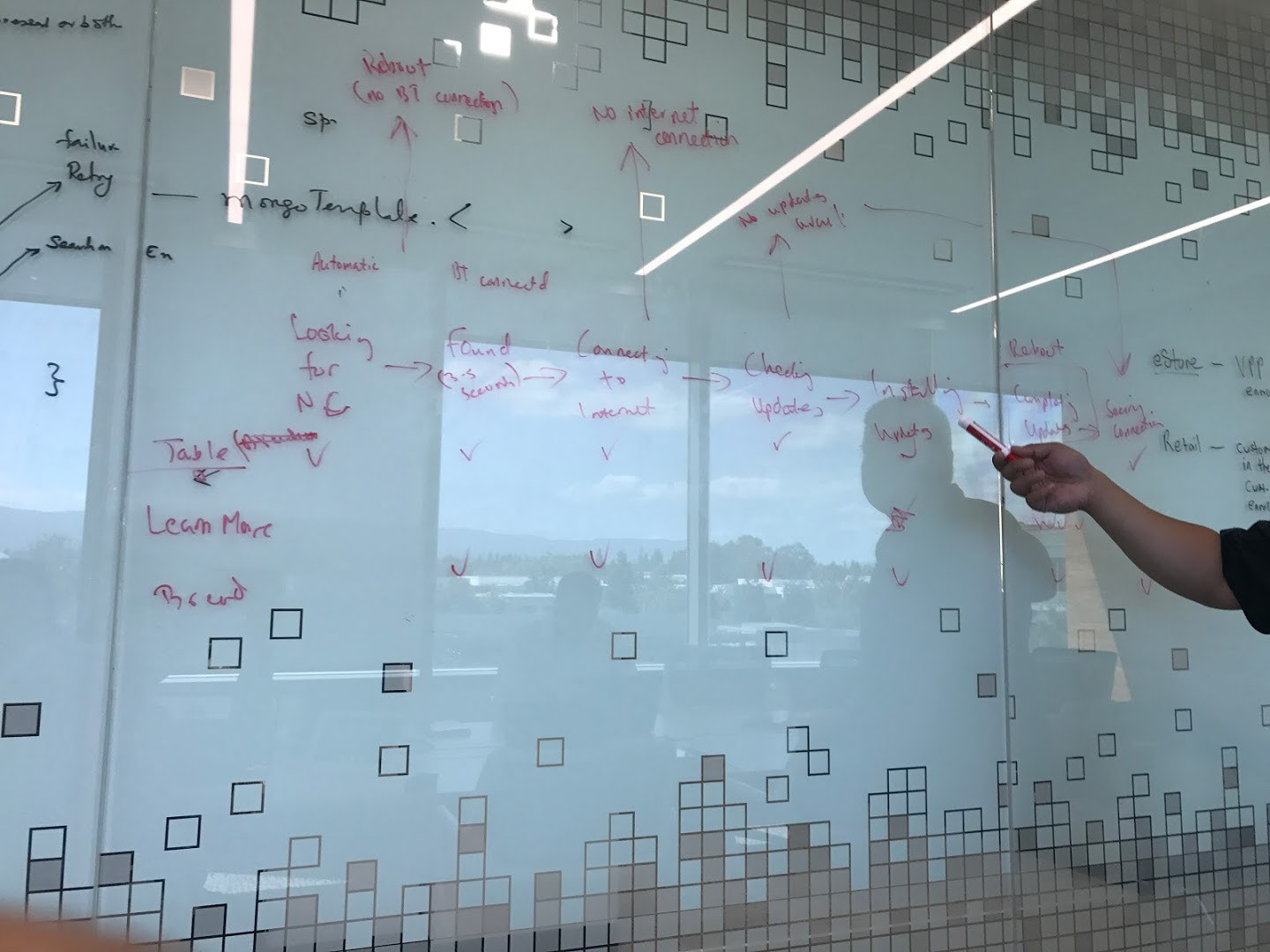
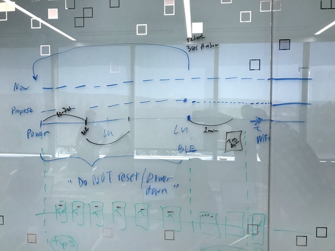
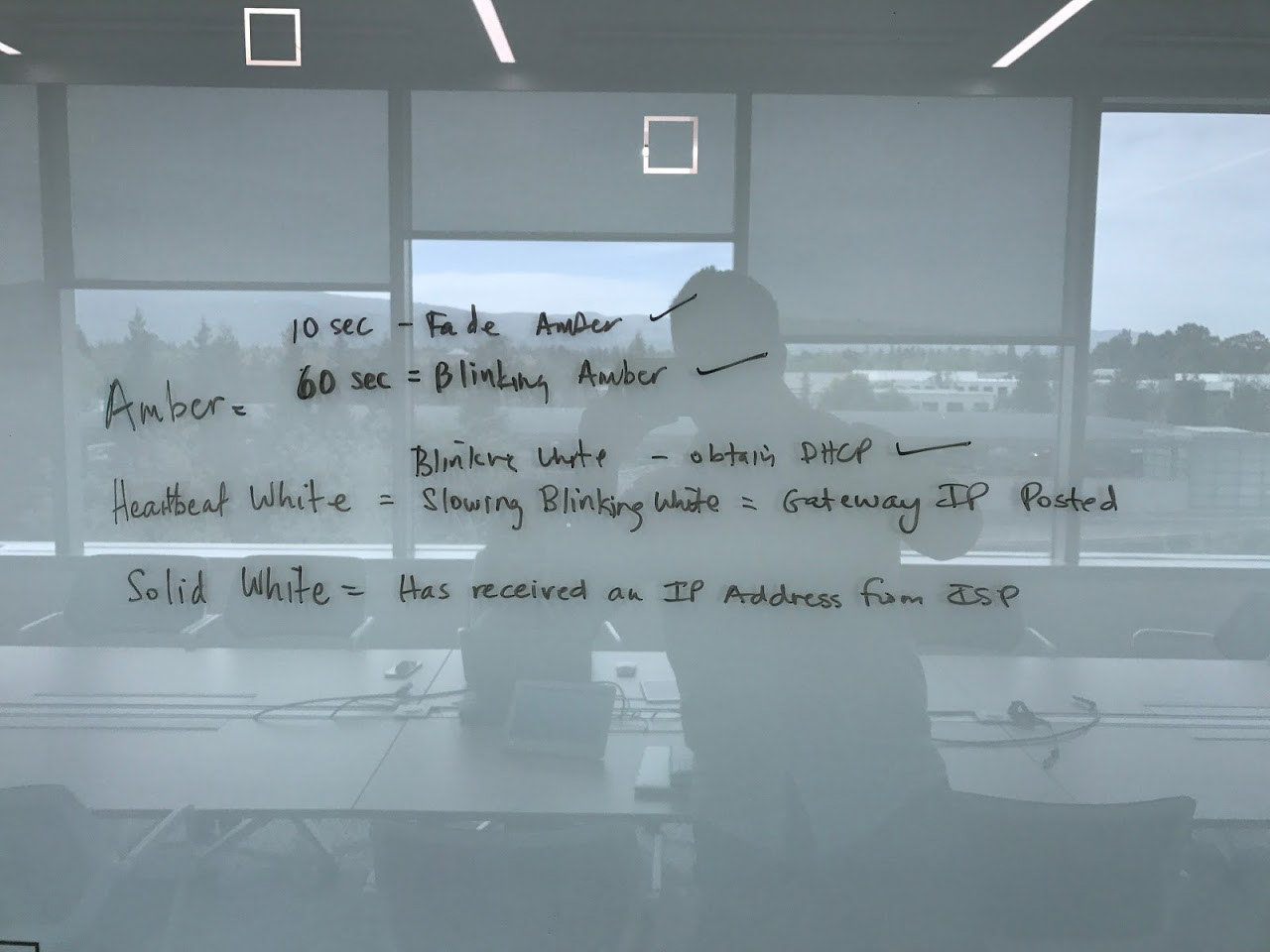
Example of one of the feature fix (LED blinking for onboarding indicator). Some of the product design required a lot of hands on meetings and synchronization with multiple teams to buy in the decision on how make a user friendly offline experience. I helped figure out how many sets of blinks we wanted and for what states they were used for.
User testing
“I found the design rather intuitive and very simple to use. I like the idea that I can add family members and they show up on the home screen. In the future, I'd like more information on sites that are dangerous.”
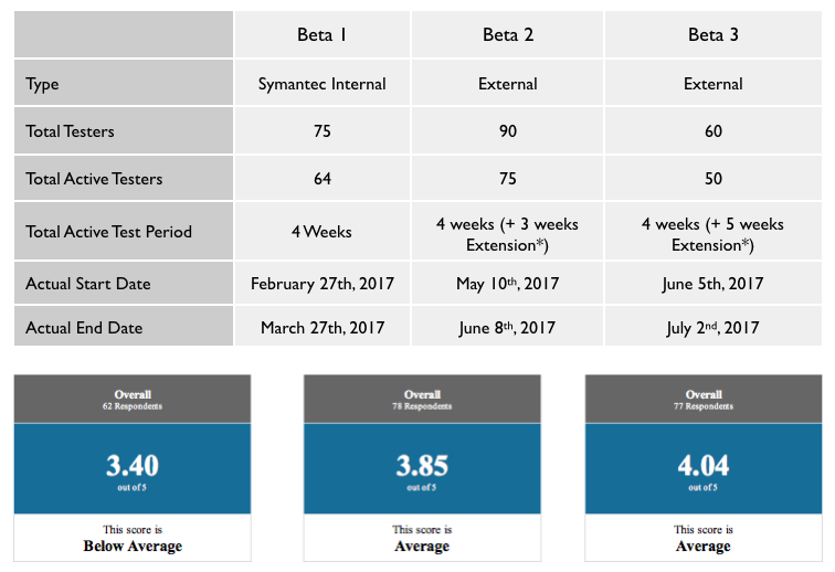
Beta test feedback
Product launch
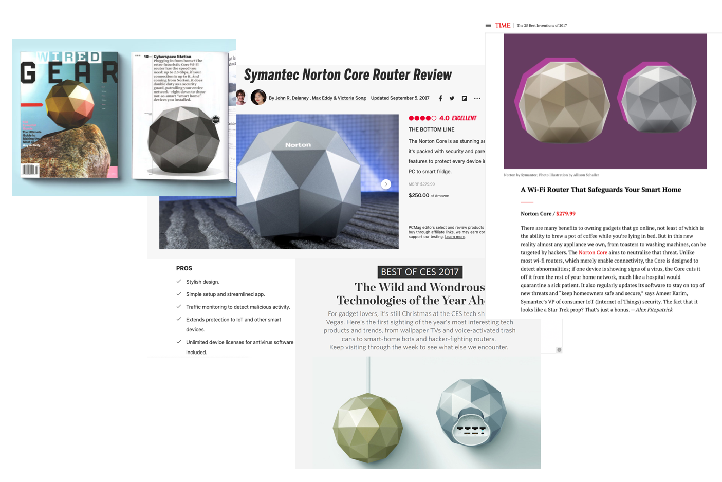
Our product launch was a hit. We earned accolades from Time's Magazine Product of the Year 2017, CES Innovation Award 2017, and earned multiple magazine features on Wired, PC Mag, Engadget, TheVerge, etc.
Refined Persona
While the accolade was amazing, I found out in hindsight after the launch that the users were much older that the initial research from marketing suggested. The beta interviewees were stacked to validate our initial assumption rather than branching out to find our real potential users. People who would purchase the product were in a much older segment. Our demographic were in or near retirement and they were cautious of potential attacks from internet usage. And that family first persona would fall under as a secondary persona.
Refining onboarding from hardware maladies
In addition, many of the controlled environment flow didn't capture red flags and edge cases. Certain conditions for internet set up created issues. I wouldn't ever pride myself on adding more screens to solve an onboarding solution as a win, but without having a method to trouble shoot and identify each potential block was a bigger problem. Each case that was reported or found, I created troubleshoot tips and tutorials help our users. What was most surprising was that we still kept our goal of being able to onboard under ten minutes (while in perfect condition would be under 1 minute).
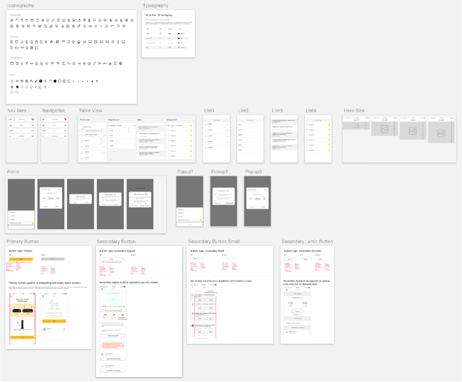
Documenting a pattern library
Future of version 2.0
Having more time to work on polish, my team explored making more visually appealing design as we looked into creating a mesh network system. The first 1.0 design there was much push back in using color and it took convincing and user feedback to get the decisions made.
Beautify through animation and mesh
What I learned
Over 25,000 units sold over my tenure on Amazon store with the ratings over four stars on the product for ease of use and set up through iOS and Android are nice accolades.
That said, we started off with the wrong assumptions. It was critical to expand our interviews early on. The benefits from that learning could have helped us gain a larger share of buyers. The team was amazing at learning and pivoting the product.