
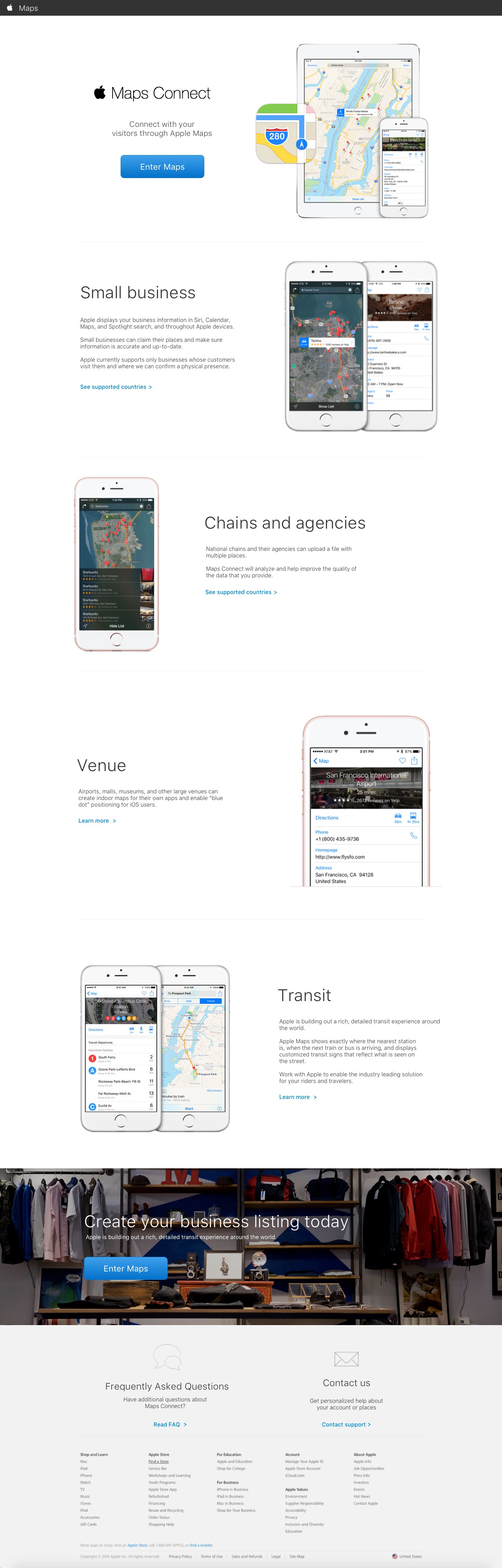
Adding value to navigation
Apple contacted me to help work on their buscustomer portal to Apple Maps so that businesses could add more value to their Maps app. Their primary goals were focused on enhancing their features and service that were mission critical. In addition, I explored how they could update the site to match Apple's new style guide.
Team
The project team were mainly engineering staff with product managers. I was the sole designer on the maps connect team with the ideal the grow the design base.
Methods and deliverables
User Interviews / Competitive analysis / Wireframing / High Fidelity Designs / Pattern Library / Prototyping / VQA
Duration
3 months
Kickoff
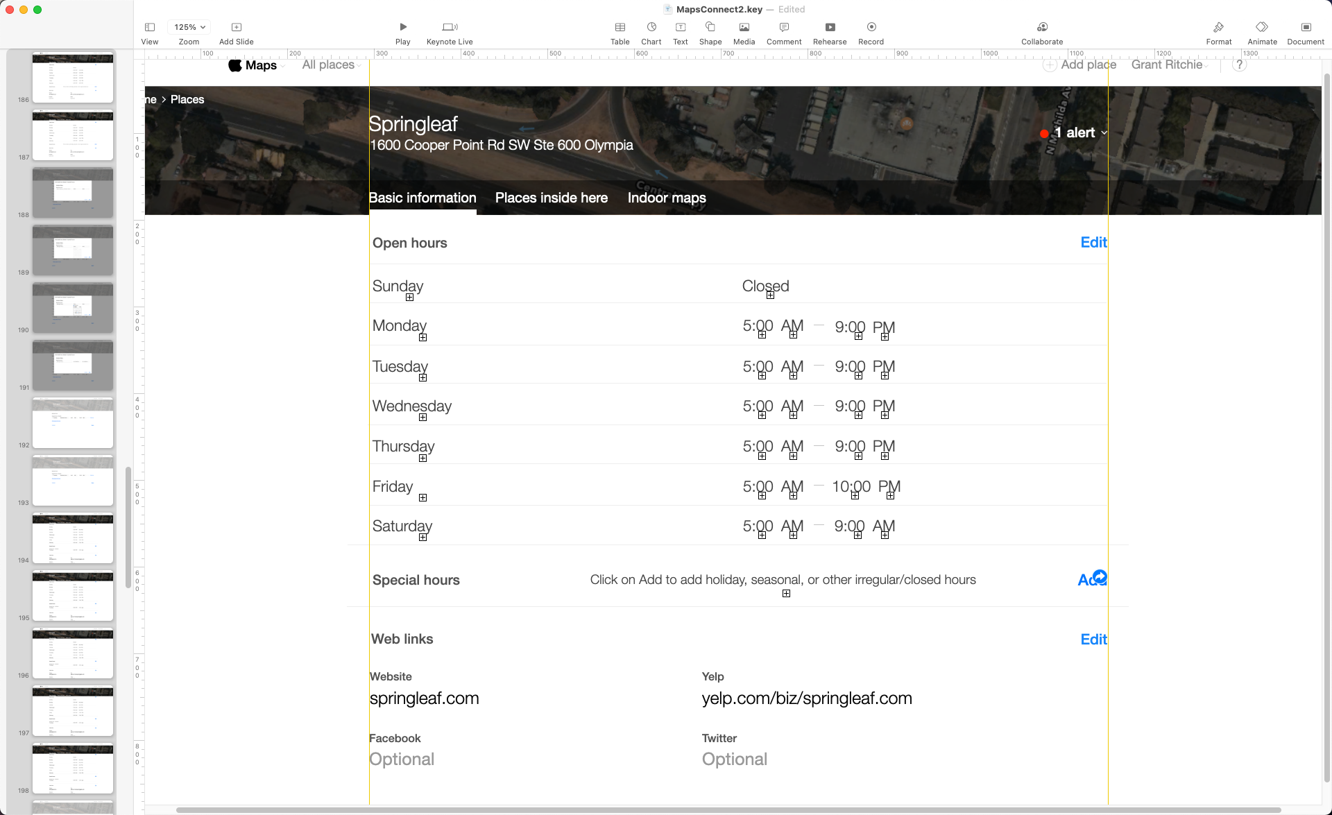
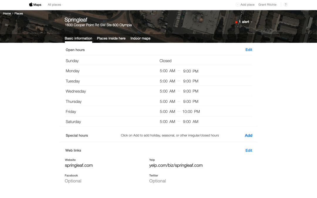
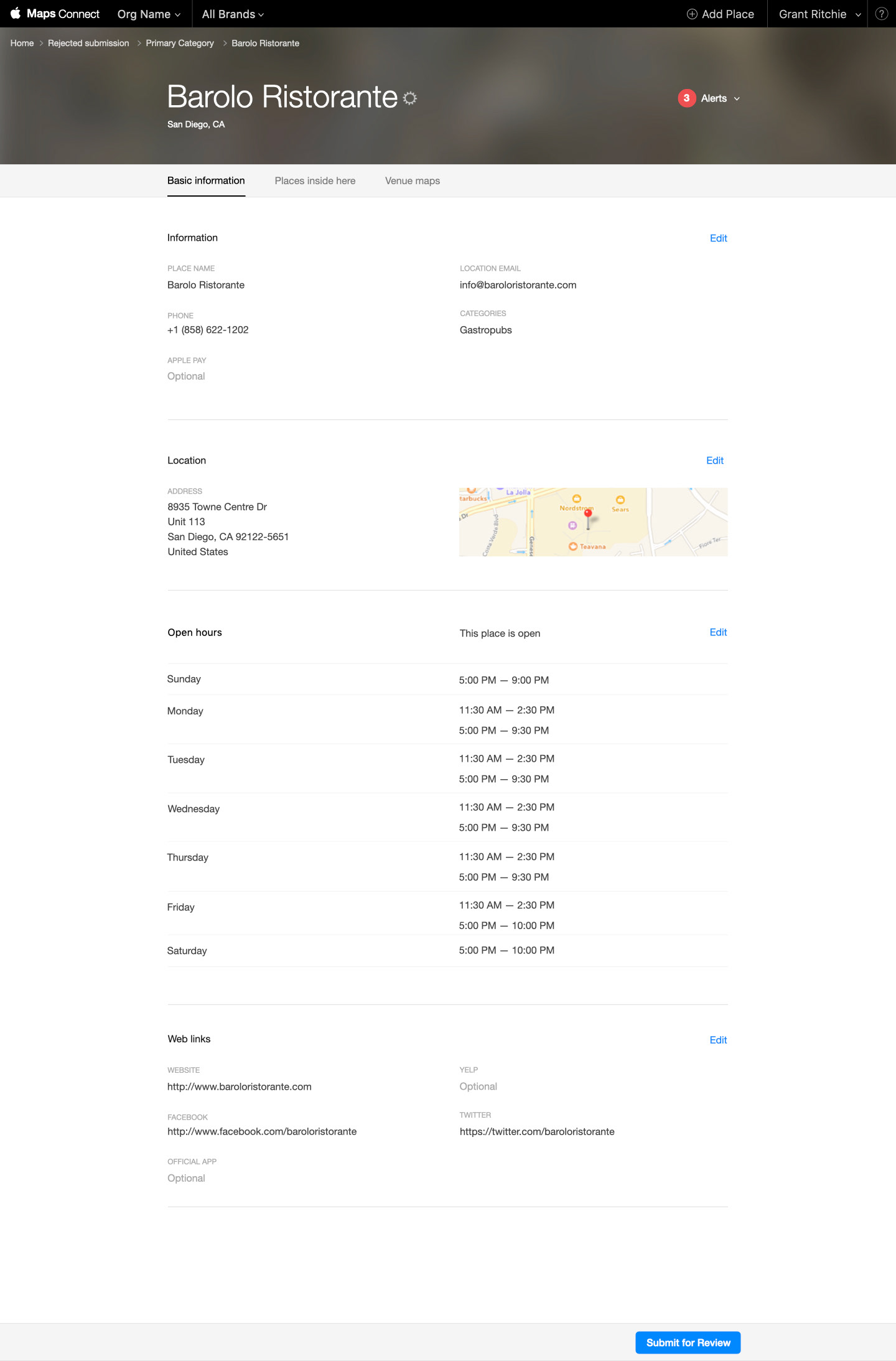
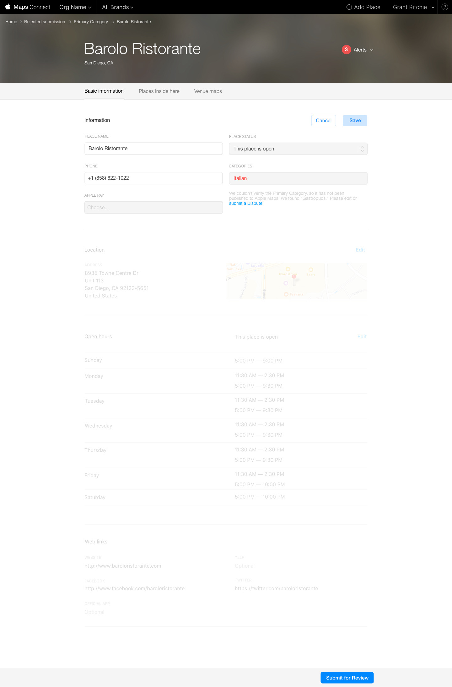
When I started working on the MapsConnect portal, there were multiple features that my product manager wanted to accomplish. To figure out which should take priority, we sat down and began to plan out and organize which had the highest priority and the access how long some of the feature designs would take to accomplish them. Based on impact and time requirements, we created a rough design roadmap and began how to tackle each feature at a time. In addition to fixing some minor flow adjustments on the portal, one of the most significant pieces of projects that I would work on would be "Special / Holiday Hours" and "Multi-level commercial building."
Research
One of the biggest challenges with the Apple Maps team was that I couldn't conduct research with outside users. All of the research was with our customer support team and dogfooding our products for testing. To validate our work, I depended on looking at our competitors to see if they had designed and how we could leverage our designs to do a better flow.
Speaking with our customer service reps
One of the most significant dependencies that we had was our customer service team in Dublin, Ireland. They would address any issues with our customers who were trying to input their business information. While we couldn't speak with our customers directly, we had access to our customer service teams, who did. We ask about some of the significant places where our users were getting stuck in adding business information. Also, we did a virtual card sort to figure out how we could better sort our information and make the flow more fluid for our users.
Competitor analysis
One of the biggest inspirations that I drew on was Google Maps to see how they solved for some of the own flows. Also, I ran a heuristic analysis to see what they were doing well and poorly to see if there was an opportunity that we could use for Apple Map. One the strengths that we drew from was how they explained the benefits of adding business to Google Maps and help navigate to onboarding. When in came to inputing hours, from my findings, we noticed that their input system didn't support easy multiple-hour changes for business hours, and the user would have to individually change each times. I saw an opportunity to make our designs have an expiration and ease of transition from normal hours to Special/Holiday hours.
We thought about how businesses large and small could have multiple events and engagements and identify multiple different times.
High-fidelity wireframes
I created all the designs on Keynote as the team preferred seeing final spec designs that could be prototyped on it as well. I would have to make my speculative documentation to ideate with other team members. High-fidelity wireframes would be done with multiple different iterative design flows.
Iterative designs
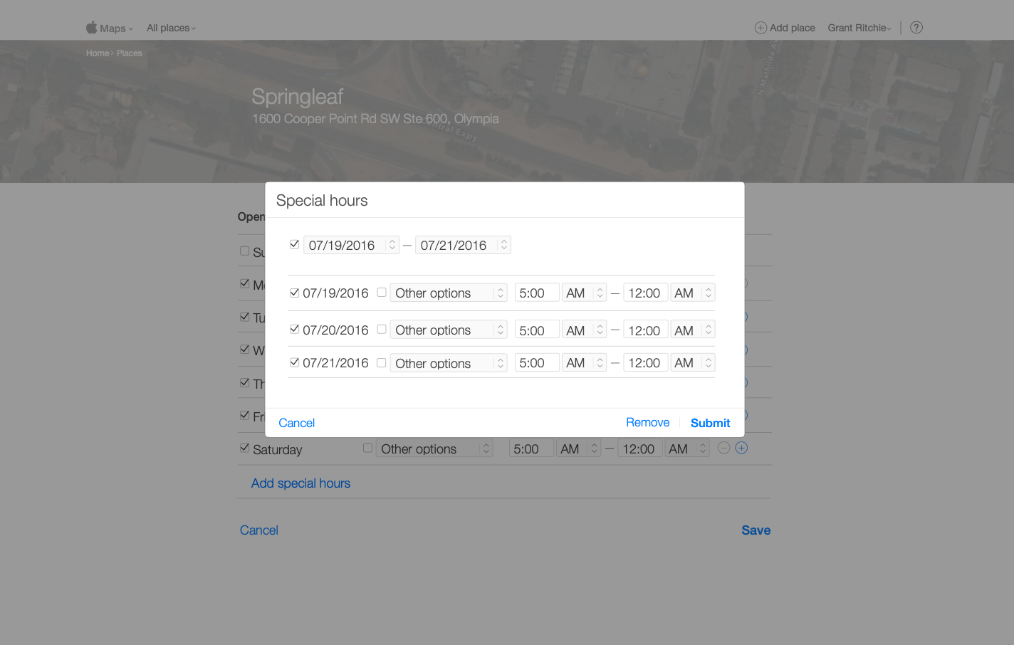

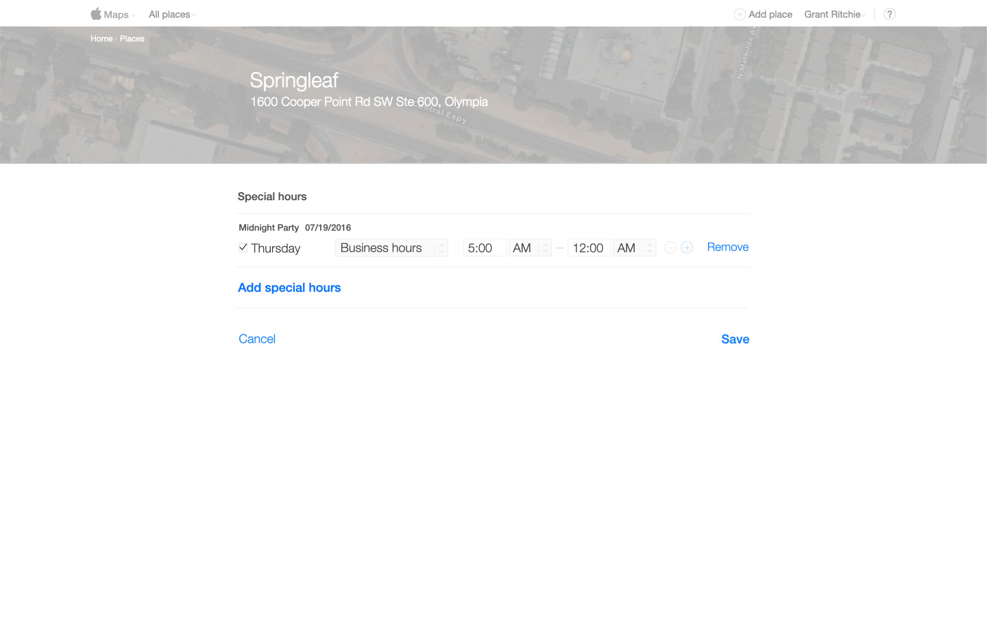
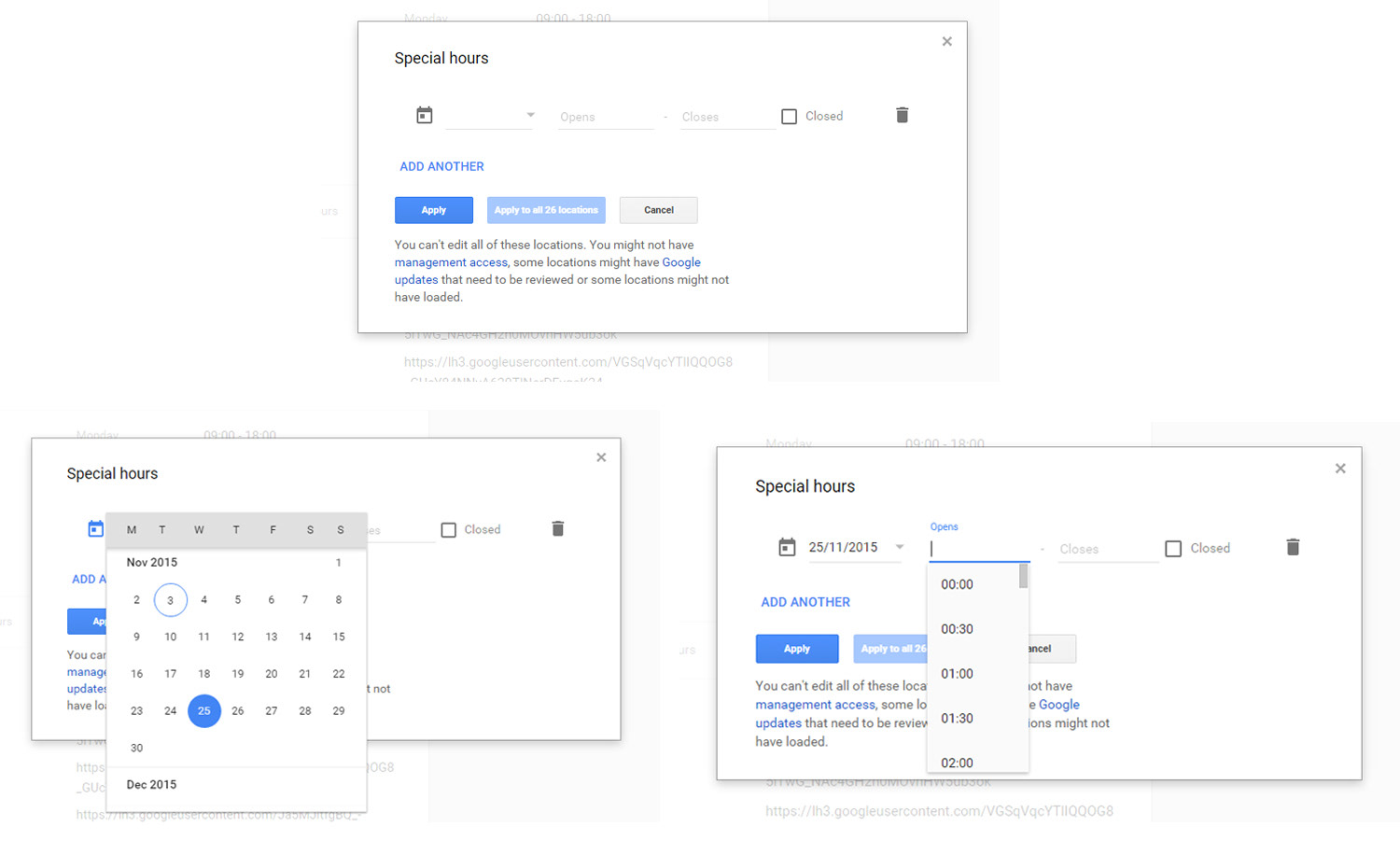
As I explored how to fit Special/Holiday hours, I first explored using modal design to add new information. As I started to build out the design, it seemed like one size fit all didn't work, and we want to make something similar to Google Maps. We wanted to create a space for just documenting special hours and events as it could be multiple different ongoing planned dates at a time. Rather than have a modal popup, I created a full-page space to document all holiday hours so that the user could organize as they need.
Special/Holiday hour prototype
This prototype was designed inside of Apple Keynote to be clickable. I would present these designs at design reviews. Follow the keynote file would get sent around other stakeholders to test and approve. Once the flow was approved, and we launched this in August of 2016, allowing for the first time special and holiday hours for businesses.
Other features, multiple locations
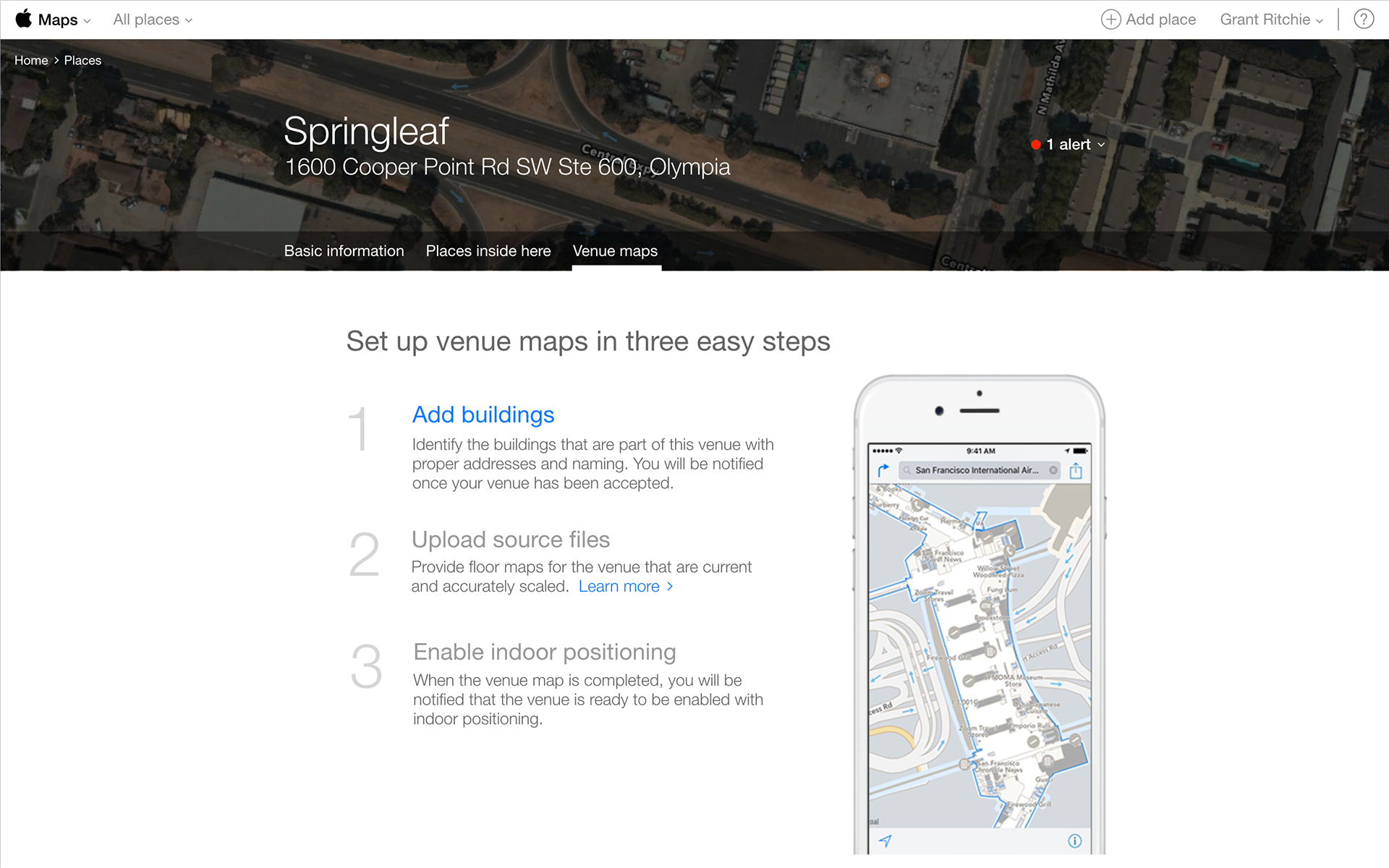
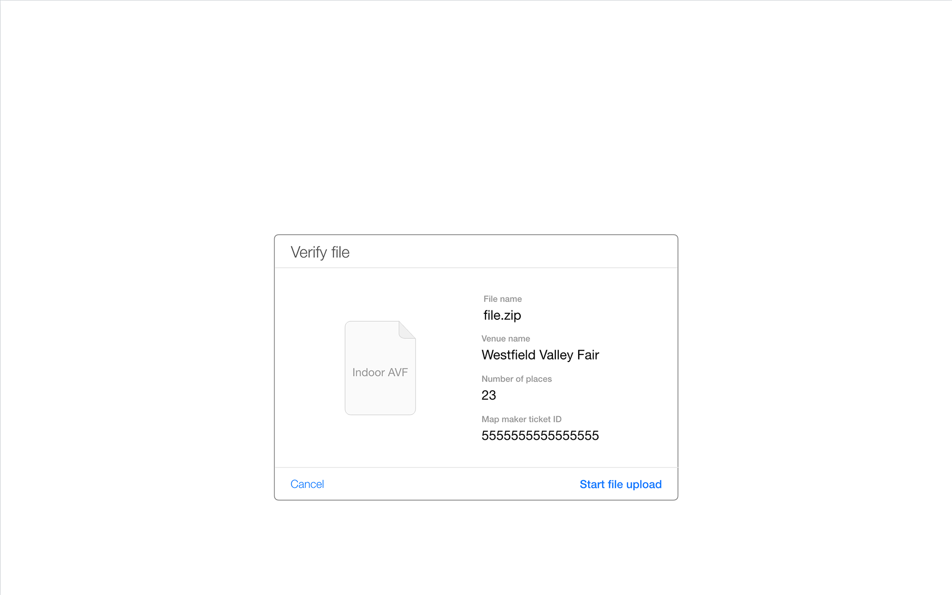
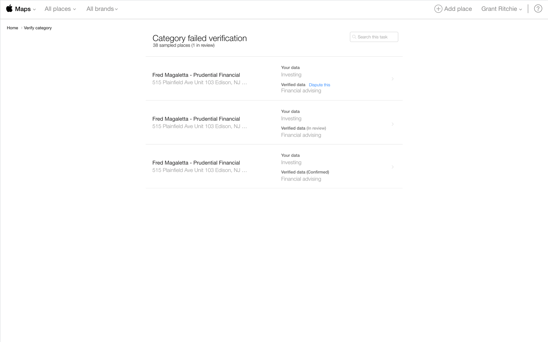
In addition Special/Holiday hours, I worked on several features that focused on multiple locations. One portion was submitting multi-level floors in buildings, another portion was focused on attaching zip files with XML data for multiple locations, and lastly verification or disputing multiple locations.
Pivot into designing 2.0 of MapsConnect
As the company shifted in their colors and style guide, MapsConnect needed to follow suit as our customers were asking if the portal was still the same company as we used and older style guide with blue being part of our main navigation flow. As we thought about making the transition into the new design system, we thought about what we wanted to position for informing users that visited the site.
The goal was to bring the best of the consumer experience by explaining MapsConnect and how the user or business would benefit by listing their information on the platform. We studied each of the functions of what Maps does and translated to how the experience worked when they inputted their business information on Apple MapConnect.
Inspiration
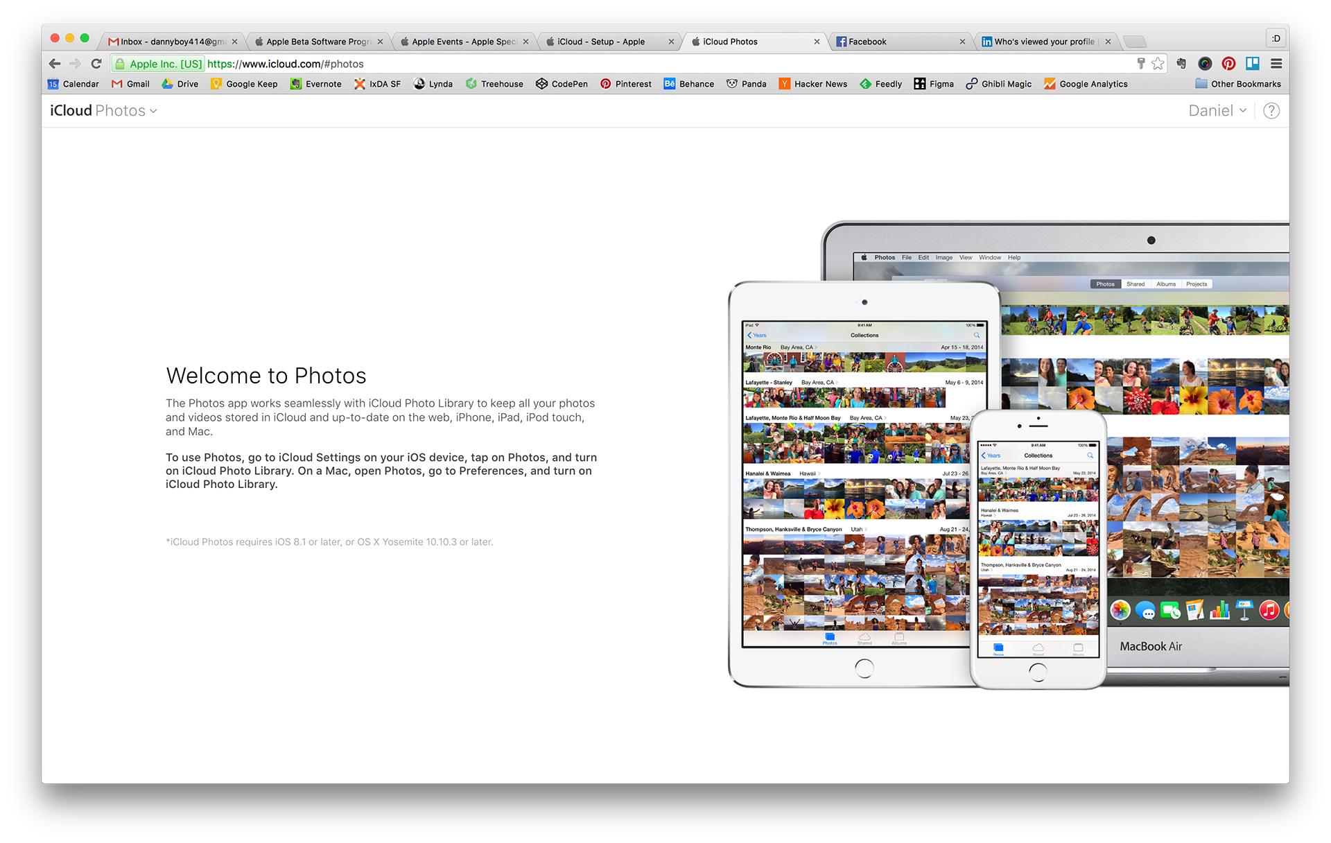
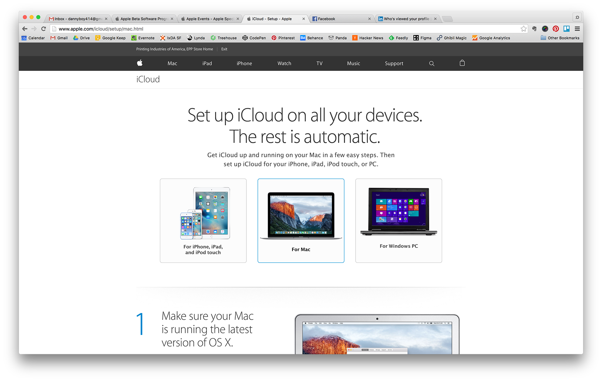
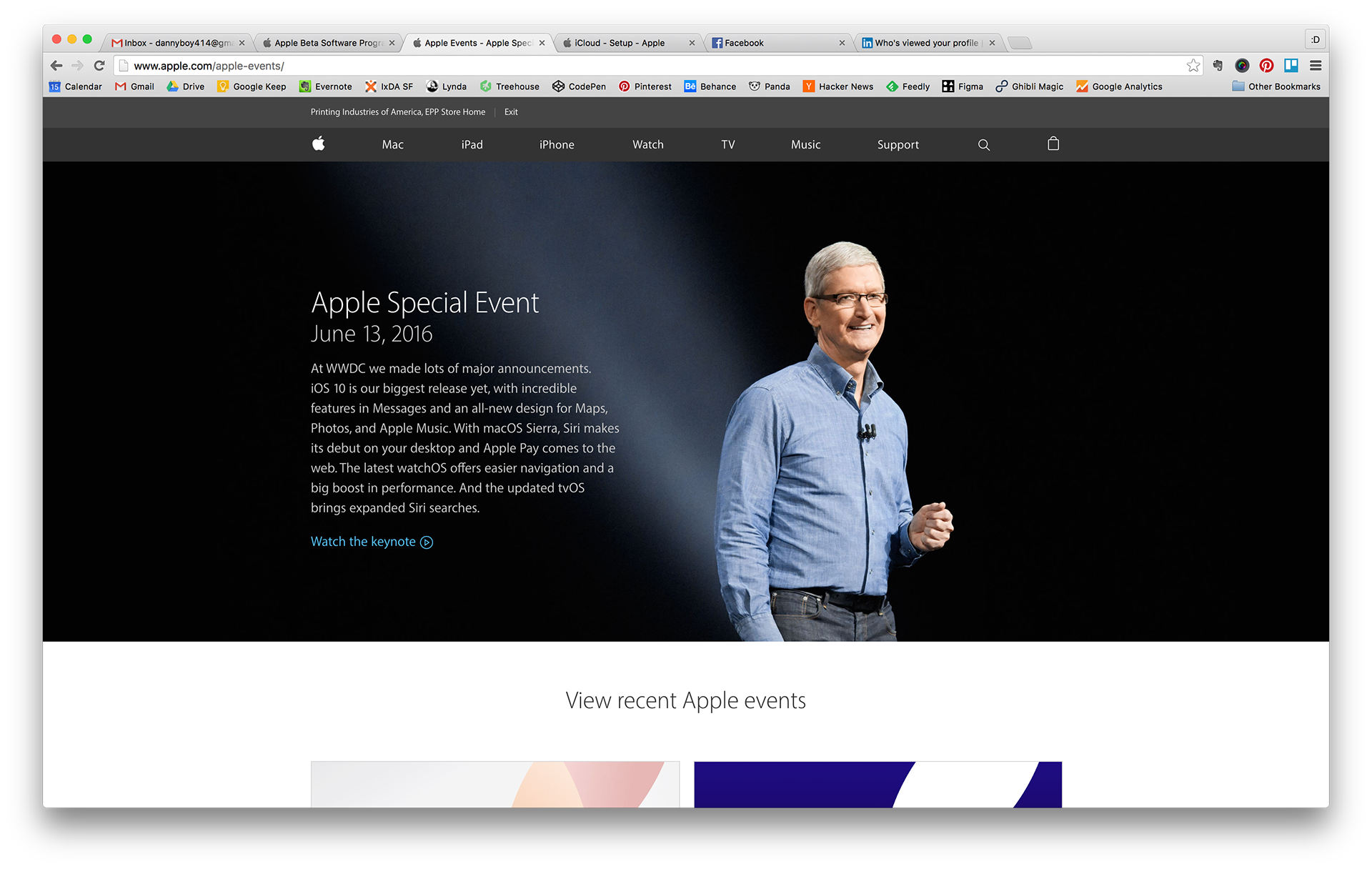
We looked at what was the best designs on Apple's current website. We took inspiration from the best parts like iCloud, photos, Apple's main site to determine which elements that we wanted to make our own.
2.0 Beta designs
We looked into how to leverage the current Apple Style Guide to see how we can leverage its current input method to work for a business-to-business solution.
Takeaway
I found out that joining a large company like Apple doesn't mean more resources. Sometimes it means that you're even leaner with your process to accomplish a project. As we created these feature flows, it was hard to assess the outcome of the effort. Metrics were not being shared with me or some other key members of the team. It felt like a disconnect in communication and what kind of impact I was creating. It was disappointing because it was hard to access what would be the next right steps. Apple Maps affect millions of users and businesses, and creating the right design decisions was crucial. I was happy that I was able to contribute to something meaningful and collaborate with some interesting team members.